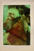
by Olive-Grace Charles Zagacki
Aldo Tolino

Aldo Tolino is an Austrian media philosopher and media artist who creates sculptural objects out of printed photographs or distorted portraits made through the use of digital art. After he has printed out the photographs he tucks, folds, creases and presses them into elaborate geometric patterns to give a brand new expression then proceeds to secure them using tape and glue and sometimes even a needle and thread. He was born in 1979 and now lives and works in Vienna. Most of his works consist of printed photographs which are folded and turned into sculptures which are then photographed, and the end ‘result’ is what is visible in the exhibitions. The folding techniques are different and so are the photographs; this is what makes the work interesting, as there is an infinite number of permutations that will work for this purpose. The distortions generate new facial representations, expressions, personalities or even deformities, translating the original flat medium picture into a manipulated deformity. This artist links to my chosen topic of hidden identity because of this. The faces are so distorted that the features of the faces are mostly unrecognisable and therefore the identity of the person is hidden. The fact that the images are folded links to the physical edits that I created whilst studying my previous artist Pipilotti Rist.
Analysis of the Artist's Work:
My favourite one of his works is the image in the middle (shown above in the gallery of the artist's work) which is one of the 'Crumpled Faces' series. I like it because of the way that it is made up of many different faces squashed together. It makes me think of how many people blend in with the crowd in an attempt to hide their personalities and physical appearance (I have written more about this on my concept page). In the photograph, not one of the faces stands out to me - we do not know if this is all one person or many different people.
Much like in Pipilotti Rist's work, I like the way that the eyes are staring out at the viewer of the photograph as if they are looking directly at them or them directly at us. Through people's eyes, we can tell a lot about a person which they can not hide like they can with their personality and physical appearance and can show us many different emotions. The faces in the artwork are depicted as part of a geometrically crumpled piece of paper which has connotations of being strong and gives the impression of it having a three-dimensional texture. I also like the fact that it is not immediately obvious how the artist created this piece.
One thing that stands out to me in a couple of Tolino's photographs is the fact that the figure is wearing glasses. This is interesting as it subtly brakes up the image and gives connotations of being manufactured, contrasting to the rest of the composition which is entirely made up of the human form. I'm not sure how relevant this was to the artist or if he had chosen the person to be wearing glasses for a specific reason but for me, it gives the entire work a different feel.
Alternatively, the image on the right is also successful because of the way that it is not a rectangle, instead, it looks more realistic with uneven edges just like if it was really crumpled which is effective as it creates more of a three-dimensional effect. This is one of the elements of his work that I would like to incorporate into my own. As well as the crumpled geometric look that Aldo Tolino creates I would like to do the same with larger, more controlled folds.
The image on the left is layered and collaged with holes which have been burnt and ripped at the edges. Although I do appreciate certain aspects of this photograph, for example, the use of the experimented application, in my opinion, the composition of this image is not as successful as the other two in the gallery above. This is because, for me, there is very little depth and the chequered base layer makes the image look unfinished and crude as if he was still in the process of editing it. This may be intentional however In my opinion, it does not evoke the same emotions within me as some of his other work does.
These works link to the theme of hidden identity and the continued idea of distortion as the faces are folded in on themselves to the point of being unrecognizable. In my opinion, this makes them particularly interesting as there is more to them than what the viewer initially sees when glancing at the photographs and, like all art, we are able to look deeper and wonder what these meanings might be.

On the left is a photoshoot plan that I created in order to help me to visualize my ideas. I find that making a photoshoot plan is especially useful to look at whilst taking the photographs as sometimes whilst I am taking the photographs I forget to include certain elements.
I will also attempt to take multiple photographs at different angles in order to create a more interesting composition using the folding tecniques I plan to use.
Contact Sheets:
Here are the contact sheets made up of photographs that I have taken inspired by the work of Aldo Tolino, the artist that I am currently studying. Although they do not immediately look like the work of the artist, once I begin my physical edits they will start to. However, before I get to that step, I will first need to use photoshop to crop the images down to just the face (as you can see I have planed this in my photoshoot plan). These will be my first edits. I will start off with just one face and then I will begin to edit the photographs together to form a crowd of faces. After this I will complete my second physical edits. in my opinion, these photographs give me a strong base to work from going forward with this project. I have marked the images that I thought were most successful with a heart in the bottom left hand corner.


First Photoshoot:

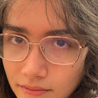
On the right is a gallery of my first edits. All I have done is crop the images so that the faces are fill the entire composition. This is so that when I fold them there are no edges.
On the left is a gallery of my first photoshoot. I think that the photshoot went very well. If you have a look at the ideas page on my website you have a look at the many different options I could chose to do next. Before that however, I will first begin to fold the faces just like the artist Aldo Tolonio's work. I have also folded photgraphs before like this whilst studying the artist Pipilotti Rist. I attempted to take a mixture of photographs with many different faces. Some are looking away, some are looking at the camera, some have glasses. This will be important when I begin to fold the photographs as they will stand out.

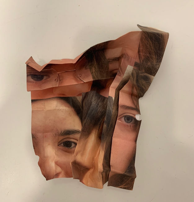
On the left is a gallery of images that I took of the photographs that I folded a bit like origami. First I folded the images and unfolded them in order to create a grid-like base which made it easier for me to fold horizontal ,vertical and diagonal. I then folded the printed out images, making sure that key features of the faces were visible. After they were successfully folded I applied tape to the back in order to secure it. In my opinion, the overall shoot was very successful.
Overlay edits:
Below, you can see some edits that I completed on photoshop using the photographs that I took of the folded images. I placed two of the photographs on top of each other and used the opacity and blending options to make the image below visible. Creating the overlays gave me the idea of printing the images out onto tracing paper. This would Give a similar effect to the overlays. I also thought that because it was going to be opaque, rather than using tape, I could sew the folds of the tracing paper together.

Redraft Photoshoot:Photoshoot Plan

On the left is a photoshoot plan that I created to help me to prepare for my photoshoot plan which is similar to my first however the colour scheme is not cohesive to the artist Aldo Tolonio's work.
In the visual arts, color theory is a body of practical guidance to color mixing and the visual effects of a specific color combination. Color terminology based on the color wheel and its geometry separates colors into primary color, secondary color, and tertiary color.
The psychology of color is based on the mental and emotional effects colors have on sighted people in all facets of life. There are some very subjective pieces to color psychology as well as some more accepted and proven elements.
I have researched each colour and decided that these were the best representations for each:
Purple
• royalty
• wealth
sophistication
• wisdom
• exotic
• spiritual
• prosperity
• respect
• mystery
Black
• authority
• power
• strength
• evil
• intelligence
• death or mourning
Pink
• romance
• love
Red
• love
• romance
• gentle
• warmth
• comfort
• energy
• excitement
• intensity
• life
• blood
Orange
• happy
• energetic
• excitement
• enthusiasm
• warmth
• wealth prosperity
• sophistication
• change
• stimulation
Yellow
• happiness
• laughter
• cheery
• warmth
• optimism
• hunger
• intensity
• frustration
• anger
Green
• natural
• cool
• growth
• money
• health
• envy
• tranquility
• harmony
• calmness
• fertility
Brown
• stability
• friendship
• warmth
• comfort
• security
• natural
• organic
Blue
• calmness
• serenity
• cold
• uncaring
• wisdom
• loyalty
• truth
• focused
Redraft Photoshoot:Contact Sheet
Below are the contact sheets of the re-draft photographs that I have taken. The photographs that I like the fest and will continue to use.


Redraft Photoshoot
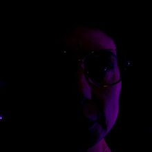
So far whilst studying the artist Aldo Tolonio, the photographs that I have taken have been very simple so I have decided to create a redraft photoshoot using coloured lights in order to make my work even more interesting. To take the photographs, I will sit with one side of my face close to my LED strip lights which I can change to any colour. This will link to my topic of hidden identity because half of the face will be covered in darkness and therefore will be hidden. Also, before I take the photographs, I will research the colour theory and how different colours represent different emotions. I will also lower the brightness as I take the photographs so that I can make one half of the face as dark as possible.


Highlighting Sucess
The reason that I chose the photograph on the left as one of my favourites is because of the way that the glasses are reflecting the light. I also like the way that the blue light transitions into the darkness with a smooth gradient. The reason that I chose the photograph in the middle was because of the way the light projected onto the face merges from purplr to blue along with the tone of the face making the overall image seem mystical. The photograph on the right also works very well because I think that it will be one of the best of the redraft photoshoot when folded because of the clear features.
Physical Edits:
To create these physical edits, I first printed out two of my favourite images from the photoshoot onto tracing paper...
I also decided to print out three of my favourite images from my Pipilotti Rist edits. I thought that I cold experiment with these and try folding them.


Folded developments:
(Using my overlays from my Pipilotti Rist inspired shoot.)

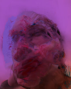
To create these folded developments, I used the edits that I took whilst studying Pipilotti Rist. I decided to use these photographs because I find them more exiting than the photographs that I took for my current artist Aldo Tolonio. This made me think about how I could incorporate the detail of the portraits inspired by Rist into my Tolonio inspired folds. I think this worked really well because of the way that you can still make out the face as well as the folded photographs not being too simple. To continue on with incorporating ideas in my project, I would like to incorporate the colour into these developments by using the colour theory which i explored during my re-draft photoshoot. My next step will be to edit these photographs to add colour
Highlighting Success:
On the left is my favourite folded development. This is because of the way that the detail and structure of the face still come across after the photograph has been folded whilst at the same time hiding the identity of the person in the photograph sufficiently. I also like the shape that the folds have created.

Colour edits:

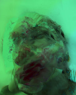
Above are coloured edits that I created using Procreate. I did this by adding a coloured layer with a low opacity on top of some photographs that I have already taken. I then blended in a second colour to create a gradient in some of the photographs. I used specific blending options in order to make the colour look as much like there had been lights when I took the photographs as I could.
Highlighting Success:
Below are three of my favourite photographs from my coloured edits. I chose one of each colour and one of each differently positioned face. I really like the image on the right because of the colour gradient from a green to a turquoise however I worry that when I fold it, it will no longer look like a face because the features are not as visible as in the others. The reason that I chose the photograph in the middle is because it looks the most like there were lights in the room whilst the photograph was taken rather than an edit. I also really like the fact that the eye is part of another block. Finally, I chose the edit on the left because of the gradient and the clear features. I have decided to print these three photographs along with three others and use these as the ones that I will fold.


Folded developments:
(Using my overlays from my Pipilotti Rist inspired shoot.)

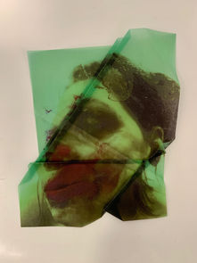
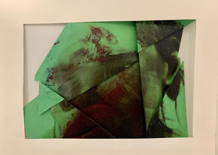
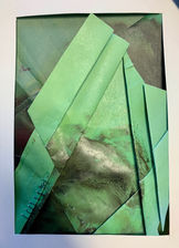
To create these folded edits, I used the coloured edits above. In my opinion these photographs worked very well with the folding technique especially the photograph where the eye is looking directly at the camera because this feature makes the face more distinguishable as a face whilst at the same time keeping the face hidden. I used a light box to take some of the photographs of the images on tracing paper. This made the folds that I had made stand out. In my opinion, the best photographs are the ones with the most folds.
Highlighting Success:
In my opinion, the image in the middle of the three that are displayed below is the most successful because of the folds that are in the perfect place where they are effective as well as not allowing the face to become too abstract. I also think that the image non the left is successful because of the way that the light box beneath the folded photograph exaggerated the folds that I have created. Finally, the reason that I chose the image on the right is simply because of the shape and colour of the folds and photograph.


Framed Edits:

Above are some physical edits that I created by adding a frame around some of the folded photographs. in some edits, the frame is around just one folded face however sometimes it surrounds multiple to create a spiral effect. I like this and it has given me ideas for my next artist. For my final outcome of this artist I would like to create a box using these framed photographs. The frame looks uneven because of the angles that I took the photographs at so I created two digital edits (shown on the right).


Highlighting Success:


I have chosen these two photographs as my favourite. I chose the one on the left because of the way that the folded edits are positioned and layered around the edges. Although it is not positioned perfectly, I think I could work on creating more of themIt reminds me of the artist Angela Glajcar and her sculptures - maybe could look at this artist in more depth. I chose the second physical edit because of the folds in the photograph and the way that the light shines on it to make it seem metalic. Next time I would make sure that I took the photographs including the whole of the frame in order for it to look even.
The Cube(my outcome)

Here is a gallery of photographs that I have taken of a cube that I created. I have taken a photograph of each of the different sides. I also placed a light inside the cube so that the light would glow through the sides made of tracing paper. I framed each one of the folded photographs before placing them together to create a cube.


