by Olive-Grace Charles Zagacki
Pipilotti Rist


I have chosen to study the work of Pipilotti Rist. Rist's work is known for its multi-sensory qualities, with overlapping projected imagery that is highly saturated with colour, paired with sound components that are part of a larger environment with spaces for viewers to rest or lounge. Rist's work often transforms the architecture or environment of a white cube gallery into a more tactile, auditory and visual experience. She was born in Switserland and studied illustration, commercial art and photography at the Institute of Applied Arts in Vienna, Austria from 1982 to 1986. She has lived and worked in Zurich and in the mountains of Switzerland since 2004. Slow showers of vivid colour tones permeate the moving, sonic and spatial video works of Pipilotti Rist. Audio is an integral component in her installations, and Rist has collaborated with musicians for decades. Above you can see three of my favourited of her works. To create them, she presses her face against the glass. She wears lots of makeup so that it smudges against the glass, distorting it and representing the idea that women should have to look 'perfect' all the time as society suggests. I think that these look similar to the photographs I took when I was studding Evilsabeth Smitz-Garcia. Instead of pressing my face against a scanner, this time I will press it against glass (the shower door). I was also thinking about using clingfilm rather than glass as this would create more contour lines and shine.
Pipilotti Rist: Be Nice To Me
“When I close my eyes, my imagination roams free, In the same way I want to create spaces for video art that rethink the very nature of the medium itself. I want to discover new ways of configuring the world, both the world outside and the world within."


Concept Exploration:
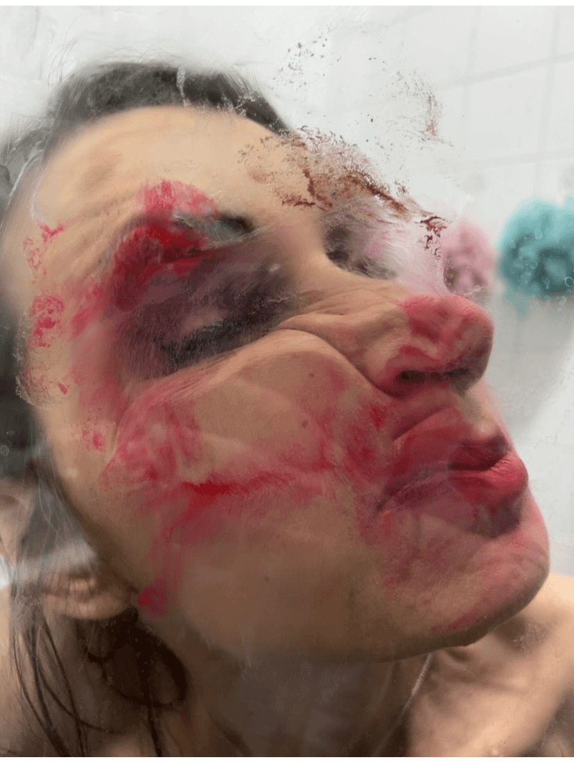
This is Be Nice To Me by Pipilotti Rist made in 2000. In this photograph, she is depicted squashing her face against a sheet of glass. She is wearing a lot of makeup and it is smudging against the glass. In my opinion, this makes the overall photograph more interesting. It almost makes her look as if she has been squished inside a packet. However, one thing that I would change would be the colours that she used as I don't think that they go with the aesthetic of the image. When I create my photographs, I will use colours that both look good together and have meaning. This photograph uses low key lighting. This work reminds me of the last artist that I studied called Elizabeth Schmitz-Garcia. It relates to the topic of hidden identity because of the way that the artist explores gender and the way that people see us. The reason that this piece stands out is because of the idea that women should look perfect and be ladylike whereas this image depicts Rist smudging her makeup and squashing her face - the opposite of what we might usually expect. I find this work really interesting as it is completely unique and displays so much hidden meaning, representing such a strong idea of looking imperfect. This representation links to the theme of Identity as Rist is exploring her own identity and how she would like to be viewed by others as well as her own opinion of herself. The element of Rist's work that I would take into consideration in my own work is the continued idea of distortion and the way that we hide our identity. Also, in order to further this, I would like to add Vaseline to the glass as this would create more smudges, not just distorting the face but also the background even further. In my opinion, the most successful element of this photograph is the fact that her eye remains open, looking into the camera. This may mirror the fact that the work has the purpose of sending a message to the viewers of her work.
To explore the artist Pipilotti Rist further and begin to understand more of the meaning behind her work, I decided to research the idea of beauty standards as I think that this is a big influence on her photographs. It also links to the idea that I have already been exploring, hidden identity. On the left is an article that I found whilst researching the topic. I have highlighted the key points.
Pipilotti Rist: Photoshoot Plan

Here is my photoshoot plan that I have created in order to work out my Photoshoot that I am going to take inspired by the artist Pipilotti Rist. It also helps me to plan in advance for elements of the shoot that could possibly go wrong.
On the left I have drawn a quick sketch so that I can visulise the photographs which I am planning to take. I have annotated them with notes which help to clarify some points which I have written about on my photoshoot plan.

1st Photoshoot Contact sheets:


Now, this concept, as well as her work is more relevant than ever. I feel that due to social media, photo filters and cosmetic surgery, there is almost a pandemic of beauty identity crisis. I feel that the over-saturation of 'perfect' ideals diminishes a person's sense of self. In my mind, this relates to the idea of mental health that I explored through the artist Evilsabeth Schmits-Garcia.


Here are all of the photographs that I took during my photoshoot.
One thing that I would do differently next time would be to make sure that the background was black or white as the detail in the background of some of the images takes away from the focus on the face.
Here is a more refined contact sheet of just my selected favourite photographs from the photoshoot. Of my favourite photographs I have chosen five favourites (shown with a green dot in the corner)and two that i don't like so much (shown with a red dot in the corner).
1st Photoshoot


Overall I think that my photoshoot went very well. My plan helped with this because when the clingfilm idea didn't quite go to plan, I had my backup option of using glass already thoroughly thought out. The cling film did not work because it was hard to smudge the makeup in the right way and it easily got so smeared that you could not see through it. Another thing that I changed was the black background. I did attempt to use the black background setting on portrait mode on my phone but It didn't always work so I decided to stop and instead I will edit the background to either black or white on photoshop as part of my first edits. One thing that I added to the photoshoot that I did not originally plan was that before asking my mum to rub her face on the glass, I smeared vaseline on there so that the makeup would smudge more easily. This reminds me of an aritst that i say at the fruit market gallery in Edinburgh called Karla Black. In my opinion, this tecnique worked really well.

Highlighting Success


I chose these three photographs as the ones that I think were most successful from my photoshoot. I chose the one on the left because of the way that the clingfilm is pressed onto the face. However next time, I would make sure that the clingfilm covers her entire face as this would make her seem as if she has been wrapped up. The reason that I chose the photograph in the middle was because of the way it almost looks as if it is a painting. I accomplished this by smearing vaseline onto the glass before asking my mum to smudge the makeup onto it. This gave a fussy effect as well as allowing the makeup to smudge more easily. Finally, the reason I chose the photograph on the right was because of how clearly the lipstick is smudged on the glass. This also gives the impression of movement more than the other photographs.
On the left is a gif that I created to help to show my process of creating my photoshoot. It shows my mum pressing her face against the glass and smudging the makeup off. To create the gif I took a burst of photographs (using the photograph shown below - if you look carefully you can see that this is one of the still images from the gif) and uploaded them to a website that creates gifs.

First Edits:


To create these first edits which incorporate colour, I used photoshop. This enabled me to sharpen the images, clear the backgrounds and add definition before changing the hue, saturation and brightness. These three tools helped me to create some more exiting photographs. To make the colour placing more abstract, for some of the edits, I duplicated the image and moved the layer slightly then used the blending tools to create colour. Before taking any of these steps, I first cropped the images to create some more interesting compositions, to do this I used the rule of thirds.

Highlighting Success


I chose these three photographs as my three favourite photographs because of how face is distorted. I like the one in the middle as I think that having one eye open is very effective. I also really like the use of clingfilm in the one on the right and I think when I do a redraft photoshoot I would like to use clingfilm rather than glass because it was so effective. However then I will have to make sure that the clingfilm covers her whole face so that it would look a bit like it is wrapped in a plastic packet. I chose the third one (on the left) because of the placement of the smudged makeup which compliments the filtered colour over the top as well as the wrinkles in the clingfilm.


2nd Edits - Overlays
To create these overlays, I used my first edits. A few of them are made by laying one image on top of a different one and changing the opacity and blending options however the others are made by placing the same image on top of the other (and again then changing the opacity and blending options). In my opinion, both methods proved successful. I think that the two biggest factors that were in my head whilst editing were texture and colour. The photographs that incorporate clingfilm have a shiny, reflective texture that I have attempted to exemplify whilst overlaying them. Whilst the others look as if they have a texture similar to thick wet paint.
The images now remind me of the work of the artist Jenny Saville, an artist that depicts the human form in a modern style using paint.

Highlighting Sucess


In my opinion, these three photographs are my favourite of my overlay edits. I think that the middle one is particularly successful because of the way that it almost looks as if it is a painting. I love the detail and the patches of colour. The photograph on the left also has this effect. The reason that I chose the photograph on the right was because of the way that the collaged eye looks as if it is both part of the base image and the added image.

Second Photoshoot
For my second photoshoot I am going to mix the style of Pipilotti Rist and Elisabeth Schmitz-Garcia (my previous artist). I will do this by printing off some photographs which that I have already created inspired by Pipilotti Rist and slowly moving them across the scanner. An effect I have previously used. It might take a few practice attempts to create a more smoothed image and work out which way I need to drag the photograph to elongate it. Once I have scanned the photographs to create even more exiting Images, I edit them on photoshop then print them out and I will fold them along the lines than are created by the scanner. This will be my physical outcome.
Contact sheets


Second Photoshoot


On the left you can see a gallery of images from my photoshoot. The quality isn't very high because I was using a scanner and these printed straight out. That meant that I had to take pictures of the printed out images. Therefore when I edit the photographs, I will increase the brightness and contrast. If the photographs still have bad quality after these steps, I can always take the photographs of the A4 print-outs again.
Because I printed the photographs out small enough to move across the scanner, It meant that the entire background couldn't be white. On most of the photographs, there is a line of black at the top and bottom of the sheet of A4 paper. When I edit the photographs, I will edit these out or alternitively make them white to change the composition and to add some negative space.
Highlighting Success


I have chosen these three photographs as my favourites from the photoshoot because of their intricate detail. The photograph on the left transitions from pink to green. This was done by mistake as my printer ink ran out however I decided to keep the photograph anyway because In my opinion, It works well and compliments the image. Maybe I could edit some of the other photographs to create a similar effect. The photograph in the middle shows one part of the face repeated several times then continues to show the rest. This is helpful and it will work well with a plan that I have made for what to do next in terms of my physical developments. The face in the photograph on the right stretches out more smoothly and this compliments the shiny texture of the clingfilm.
First Edits:


On the left are the images of the full photographs that I took using the scanner (most are cropped however this was just to get rid of the edges). Whereas below this is a gallery of images that are of smaller sections of the photographs. This captures more detail as well as zooming into the intricate patterns. All of these edits are subtle however they will help to form a base for my second edits. First I cropped the images. For some this was just the edges and for others it was more in order to create a more interesting composition. I then altered the saturation, brightness, contrast and sharpness. This brought more of the structure and detail back into the images. For my second edits, I will use photoshop to overlay the images and edit their colour further.
Zoomed in sections


Highlighting Success


The reason that I chose these three images was because in my opinion I think that they are the most sucesfull of the edits that I created. Although the edits do not seem like they have made that much of an effect, I have changed the sharpness and contrast to bring out extra details. This will be helpful in the future when i create my second edits. For example, the image on the right hand side is a zoomed in image and therefore at first was quite blurry and pixilated with soft edges however now the flicks of 'paint' are clearer and the details are much clearer.
Second Edits:


In my opinion, these edits were very successfull. By completing the first edits, I made the images a good enough quality to be able to edit them to a good standard. To create these, I used a mix of photoshop and procreate. One thing that I did on photoshop was get rid of the dark and uneven edges around the white backgrounds. I did this by using the fill tool (I have explained this in more detail below). I used procreate to add colour to my images for example creating a colour gradient.
My Process:

On the left you can see a screenshot from procreate (a digital drawing app). It shows the method that I used to create a glitch effect on my photograph. I decided to use this editing tecnique as it links back to my previous artist Elizibeth Smitz-Garcia and how she uses a scanner (because of the lines that it creates across the screen). It has also reminded me of an idea that I had to print out and fold the photographs along the lines created by the scanner or in this instance the glitch filter. This also links to an artist that I would like to study as my third artist in this project.

On the right you can see a screenshot from photoshop which shows where I have used the fill tool to fill in the background of my photograph. This editing method leaves some subtle patches in the background that almost look as if they have been painted and I think that this works out well because in my opinion it looks better than if the background was plain white

On the left is a screenshot that I took whilst overlaying one photograph on top of another on photoshop. To make both layers visible, I changed the opacity settings (as you can see at the bottom of the screenshot on the left). This didn't work too well using those two particular images as they were both complicated with similar tones. Next time I use this tecnique, I will try to use more varying images.
Highlighting Sucess

The purpose of highlighting success is so that I can work out what went well from during my photoshoot or editing (in this case editing).
I have chosen the edit on the left as one of my favourite edits because of the overlaying technique that I used (you can see the process that I used to create it in more detail above). The colours are very subtle but work well together however, in my opinion, the overlaying didn't work as well as I would have wanted it to as it makes the image unclear and quite abstract. Having said that, I really like the way that it has kept the look as if it had been painted .

I created the edit on the left using photoshop. I did this by making a colour palette and then using it to edit the hue and saturation of the entire image. I think that this was very effective. When I created it I also had the colour theory in mind and the colour red has connotations of anger, fire and violence. I also thought that the colour red worked with the areas of shadow around the bottom of the image as well as around the eye sockets (which gives it a sinister feeling) in the original photograph and complimented it well.

The image on the left is my favourite out of the edits. The way that it is edited with a wave glitch will make it more interesting to fold. I used procreate to do this. You can view the tecnique I used above as part of 'My Process'.
Refined Outcome:
.jpg)
.jpg)


Above are three folded developments. To create them, I first printed out the three photographs onto A4 paper. I then cut the paper to create a square to make it easier to create symetrical folds. I then folded the photograph into lots of equal small squares and opened it up again. To make the second and third edits, I folded each alternate side to create vertical and horizontal lines only whereas to make the first edit I was more experimental and created a variety of different folds to compliment the image below. In my opinion, these developments would look better if the image was more clearly a face, which leads on to my next photographer named Aldo Tolonio.
(Frames to the left)
I have also decided to finalise some of my favourite photographs that I have taken whilst studying this artist by framing my three favourites.
My favourite of the three is the top one as the lines are bold and the lines are refined. I placed the middle image between the other two as the colours are lighter therefore it does not stand out as much as the other two. Despite this, it does have lots of detail that I think should be focused on. Finally, I chose the image at the bottom because of the way that the eye is staring forward and is collaged on rather than being part of the original image.
In my opinion, these are the best images that I have taken so far during my project as the meaning is powerful as well as the actual photographs. I really like the level of clear details in these photographs as it makes them look like paintings.