IDENTITY

“I am using myself as a model because I can go the farthest with me" – Soltau
ANNEGRET SOLTAU
her work-


“What shaped me in childhood was deprivation. […] The deprivation I experienced had such an effect on me that my present life, the person I am now, revolves around it to a great extent. And the loneliness that I often experienced in my childhood is now part of my life as an artist.”
Annegret Soltau is a German artist and photographer and one of the main personalities of the development of experimental and performance art in the 1970s and 1980s. She was abandoned by her mother at the age of 7 and was places into the care of her grandmother, who continued to raise her in poverty on a farm. Among the chores that came with her new lifestyle, she was also made to sew the intestines of slaughtered pigs; this was bound to influence her as an artist later on. She began her career as an artist in 1970 and championed an unusual and fascinating approach to photography, art and textures. While much of her work is based around the female body and its functions, the ultimate inspiration for her work is the meaning of identity and how you can use yourself and your body to represent your character and beliefs. Her images are part of a reflective process that seeks to bring together the conscious and the unconscious. Her work has been used in several exhibitions and museums such as the critically acclaimed exhibition 'Wack! Art and the Feminist Revolution' the first comprehensive exhibition to examine the international foundations and legacy of Feminist art. Her pieces have gained popularity for the complex ideas she portrays such as societies views on women and what is considered normal. Furthermore, much of her work displays strange designs and imagery to further emphasise the idea of expectations and normality within modern society, although her work has been based on these concept for decades.
“I see how the topics develop along with the topics in my life. It’s not that I depict my life as it actually is or was, but in my art I reflect on the processes that have taken place. During my last exhibition at the Mathildenhöhe, a museum in Darmstadt, I titled the first section “selbst” (“self”), the next one “schwanger” (“pregnant”), the third one “generativ” (“generative”), and the last one “hybrids,” for the hybrid beings. This made it very clear to me once again how important it is to follow one’s own process of development, to consciously experience it and accept it, to enter into it deeply, bring it to the surface and represent it in art shown to the public. The positive reactions have shown me that other people can also see themselves in it. It isn’t my wish to represent myself only.”
At the beginning of her work, Soltau took simple images and stitched cut outs and overlays onto them. Later on she began experimenting with colour and incorporating different mediums into her pieces, but the stitching remained a consistent and key element of her work. She uses generally soft and relatively low level lighting and the majority of her work is taken in portrait. As her pieces are not centered around the use of light they do not require a specifically slow shutter speed or IOS. Also, the lighting looks quite artificial, but she doesn't seem to use flash. This is key for a simple and even first layer which she can then elaborate on and expand into her more detailed and intricate pieces of work. The lines of her stitching are random and uneven and help to emphasise the absurdity of her photos. In terms of the contents of her images, they are largely centered around the female body and in an interview she said that much of her work was taken during her pregnancy as she wanted to explore the development of her body and the changes that occurred.
Specifically, one piece of work (elles x paris photo), fascinates me as it combines facial and bodily anatomy as well as the interesting textures and design of stitching and layering. The uncovered body is emphatic in representing the stigma surrounding women's bodies and the pieces stitched onto the face show hidden identity and explores insecurity. The feminist theme throughout is clear and this is interesting when looking at my own work: how does feminism relate to hiding your identity? While the random and confusing layout of the stitching could represent her childhood, it could also serve as a way to demonstrate a strong political statement about the overwhelming pressure that women receive to fit into societal expectations. She successfully portrays feelings of doubt and judgment that much of her audience are bound to relate to and that is what made me so interested in her work and this image in particular. Similarly, the juxtaposition between the quite simple and beautiful background image and disconcerting additions made to it could evoke profound feelings of discomfort but also an exposure to the urgent messages that Soltau aims to portray in this image. The fundamental message of this piece as well as much of her work is that we often try to manipulate, change and hide our true identity to fit into social norms. It encourage bravery to defy the typical expectations and have courage to embrace ourselves despite the urge to do otherwise.

Personally, I really like her work, the images themselves as well as the messages behind them are interesting and the execution of her ideas create confusing yet fascinating pieces. If I could ask Soltau something it would be her perspective on identity and specifically hiding your identity, as this is a consistent theme throughout and I would love to hear about her perspective and views on it. I'm also interested in her use of mixed media to add texture, layers and present interesting ideas about not only hidden identity, but the combination of experiences, people and places to make individuals who they are.
photoshoot plan:

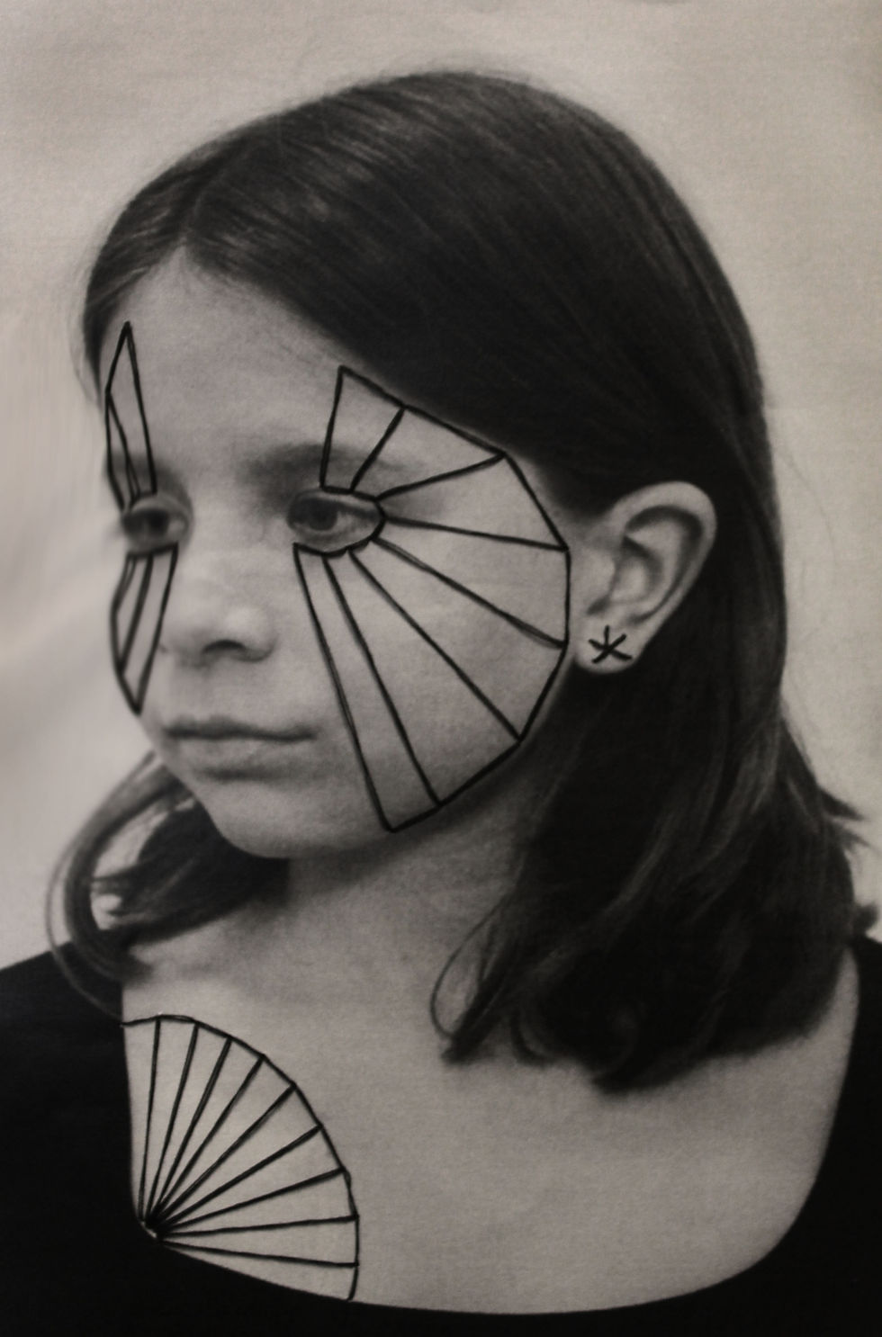
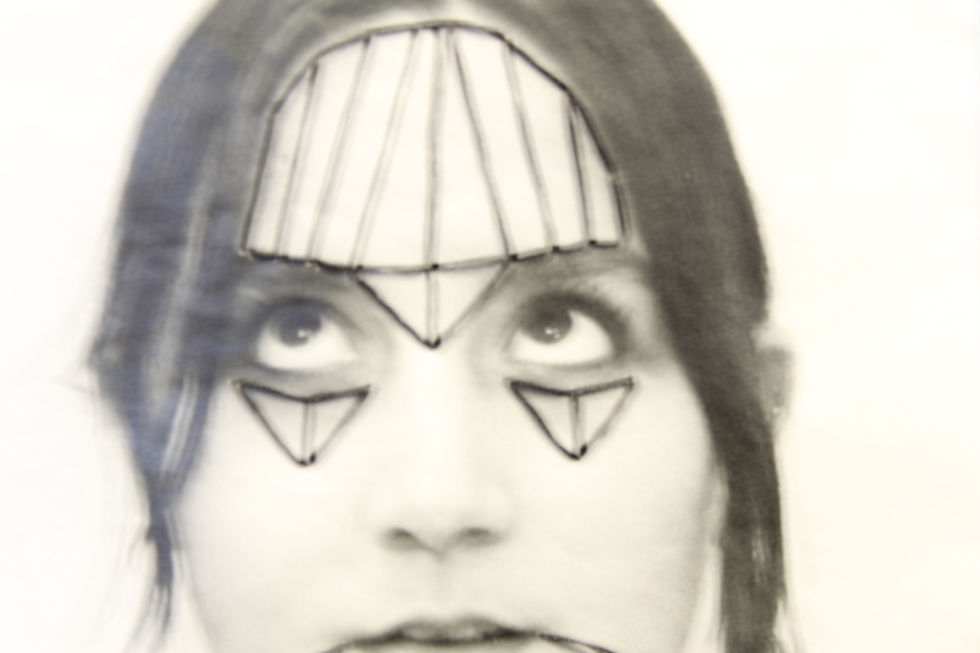
This is my photoshoot plan. In it, I made sure to include all of the components of the shoot that I would need to consider in order to take successful images and achieve the desired outcome. This includes lighting, camera settings and contents. I will refer back to this while taking my pictures as it will be helpful if I feel stuck or to remember what I am aiming for. I also included some drawings to present what I was trying to achieve as my final images and certain features to focus on (eyes, lips, nose). To present my plan, I wanted to incorporate certain elements that Soltau features in her own work, such as sewing two layers together, and combining textures and medias in general. This seemed to work well and gave me an idea of what it would be like to develop my actual images.
contact sheets:


These contact sheets present my first shoot. Overall, I would say they are successful and I'm happy with how they turned out. To demonstrate this I used circles to remind myself which ones have the most potential and I would like to carry on editing, as well as crosses to remove the less successful ones. These are less successful due to facial expressions and certain hand placements which could restrict the amount of editing I could do or experiment with. Overall, I tried to keep the images simple to maintain a clear focus on the faces themselves, yet I made sure to direct each person to do specific expressions so that I would have a variety of features to work with. When referring back to my photoshoot plan, I made sure to follow the aspects such as lighting to ensure that my photos were clean which little shadows. This was helpful as the contents of my images turned out to be clear and visible, which is key for my further developments.
initial edits:


Before creating my physical layered edits, I wanted to experiment with Photoshop to give me some initial inspiration as to what I wanted them to look like. While these did not turn out exactly how I wanted them to, it was interesting to play around with different features and layering to create different faces. Now, I have an idea of what to do when I print the images and which features and pictures are especially successful to develop further. To make these, I simply layered a second face onto the first one and cut out certain areas to place them individually. Some also needed adjustments to the contrast and saturation etc. which was easily fixed.
highlighting success:


These are my favourite initial developments as they seemed to be most successful in creating coherent and somewhat realistic images, and combining features in interesting, almost humorous ways. Although these worked quite well on photoshop, I think they would be more successful as physical collages using thread to combine more textures and bring each piece to life, resembling Soltau's.
physical developments:


These are my physical developments, which were made by printing my initial images and cutting out certain features to then layer onto the original face. Once I had decided where I wanted each feature to go, I sewed it onto the page in relatively uneven stitches to resemble Soltau's. For some I also incorporated other materials such as masking tape to add a variety of texture and colour as I pieced them together and I also wanted to play around with desaturated images and normal images for a variety. It was helpful that most of my images were taken in the same lighting and have the same tones because it meant that the contrast was not too harsh as I combined them. This seemed to work well and I am happy with how they turned out, and they've created good base layers for further editing. Unfortunately, it was difficult to upload these as I wasn't sure if it was best to scan them or take photos of them. The images I took turned them slightly grainy which ruined the quality slightly, but nevertheless, the contents are the same.
mirrored edits:


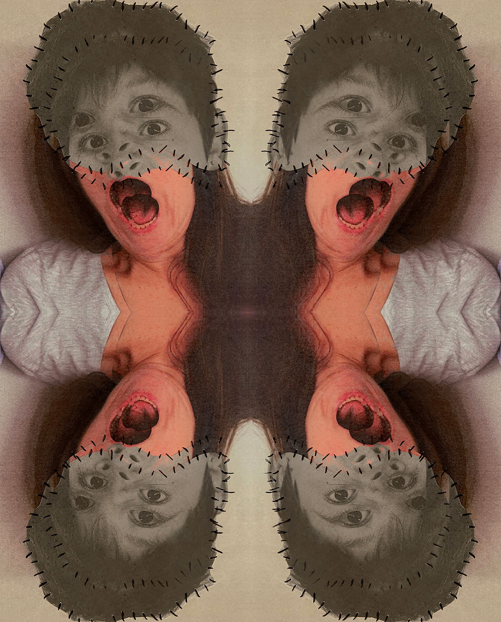

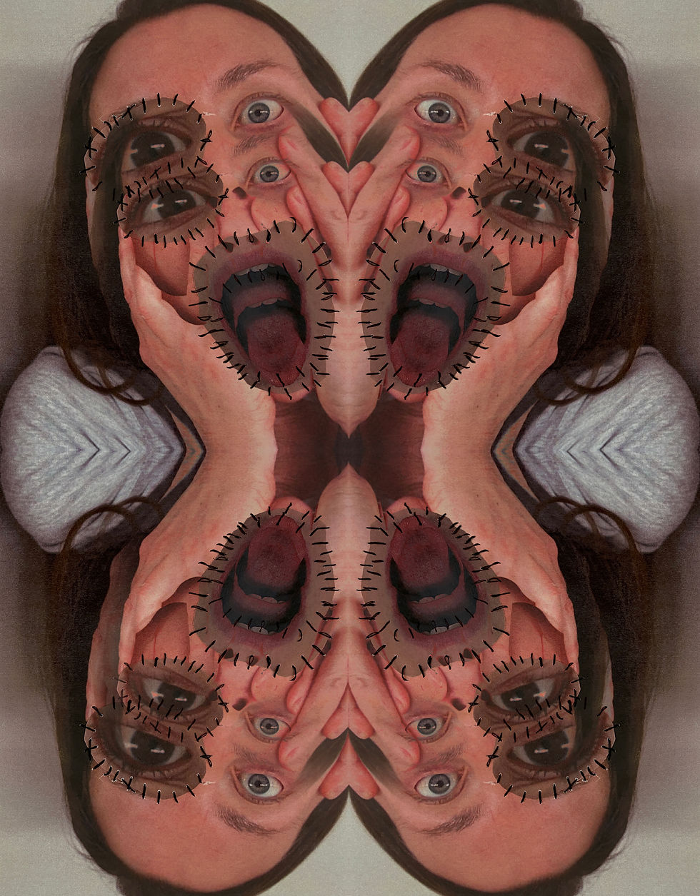

These are mirrored edits of my images, which were made in different ways by duplicating images and then changing its position and orientation to create symmetrical reflections. Some are less successful as they look a bit too crowded or incohesive, but the more successful ones are effective in making interesting designs.
highlighting success:
These are my favourite mirrored edits as they have minimal sharp lines or inconsistent areas of colour. I like the strange and almost humorous effect that combining them achieves and it adds an interesting touch to both the images and the overarching topic of 'fantastic and strange'.
layering and collaging:


I wanted to experiment with layering and collaging my physical developments and using certain faces for the background to emphasise the strange and somewhat uncomfortable features of my images. They are quite overwhelming and disorientating as there is much more in each image than before, which either brings attention to all the collages or becomes confusing. While these were just experiments and I wasn't sure how successful they would be, I'm quite happy with how some of them turned out as they are interesting and more complex.
experimenting with colour:


These are some coloured developments made from my physical collages. I wanted to add a more interesting and creative touch to my previously simple edits. Again, they turned out a bit strange and I'm not sure how I feel about them, although some are quite successful and I like how they turned out. The more successful ones have clear separated features and coherent colours, while the less successful developments have uneven compositions and the overlays in the background are too harsh or juxtaposing.
process:

To edit these I created separate layers for each feature and then dragged a coloured layer onto each feature which meant that it would only apply to the selected area. This worked well, combined with altering the opacity of the colour and the hue, and I was left with individually coloured features. This also meant that the colours were not too overpowering as the aim was not to make colour the central focus, but just to add a more fun and interesting addition to my images.
highlighting success:


These are my favourite coloured edits as the colours are quite soft and pleasing and the backgrounds/colours do not detract from the faces themselves. The lines and shapes are also much more organic rather than sharp, so it isn't too bold. Some give a psychedelic effect which is interesting as Soltau doesn't explore this much in her own work, so I wanted to add my own touch to these images.
exploring materials
transfers:


To develop my work further, I wanted to experiment with textures and materials to present my images differently. While I expected the quality of these to be better and for there to be less gaps in the pictures, I like how they turned out and the imperfections add an interesting and unique touch to my work. I also wanted to play around with colour and see how vibrant the coloured edits would turn out once I covered them with glue and other things, so I used a mix of basic edits and coloured edits. Surprisingly, the colours transferred well and my images are quite vivacious, although once these were done I also edited the hue and contrast on Photoshop. These are emphatic in representing the imperfections of our identity and the combination of the initial edits (to represent different aspects of our identity) and the strange and empty sections (to show the gaps we are yet to fill) are very symbolic of the overall theme.
shoot #2

For my second shoot I was intrigued to explore Annegret Soltau's images from her project 'Self 1975-76', in which she embroiders black and white images of herself from this time. This was the first she had done using needle and thread, which soon became the most notable feature of her work. Unsurprisingly given the title of this project, these images are also closely linked to the theme of identity and the self as she uses thread to distort and adjust her pictures to create emotive and provocative imagery. While these are more 'gentle' to look at and clearly less disturbing and unsettling, there is still very emphatic meaning behind her work which will be interesting to explore further.
photoshoot plan:

This is my photoshoot plan, in which I described each aspect of the shoot that i would need to take into consideration so that I could create successful images. This includes camera setting, contents and lighting, as well as editing to show what my next steps will be.
contact sheet:

For this shoot, I simply took portrait head shots, as Soltau does in her own work. I used natural lighting to create even base layers and minimize shadows which are not ideal for my developments. I also ensured that they wore simple black clothing, which also shows some skin as this is a key element of her images (and symbolism of the feminine body). This was overall quite successful and I will use these to create further developments.
desaturating:


Before printing the images to develop further, I needed to desaturate the images first to resemble Soltau's work. I did this but decreasing the saturation and then editing them slightly using the 'curve' tool. While mine turned out slightly darker and more contrasted than hers, it may prove to be beneficial as printing on paper can sometimes make the images show up slightly lighter than the original ones. Nevertheless, it will still work to develop.
physical developments:


These are the physical developments of my photoshoot. I printed the black and white images and used black thread to sew patterns and details to each picture. I aimed to resemble Annegret's images quite similarly, so an improvement would be to add my own touch, although they turned out the way I had planned and wanted. Some are more successful than others due to the placement and thickness of thread, but I like most of them and tried to created even and unique images. For some, I decided to make them symmetrical, but the faces turned to the side were quite difficult so I just sewed random patterns.
highlighting success:
These are my favourite developments as they are quite detailed and most interesting. I did these last, so I used all the observations from previous edits so that I could perfect these. This included drawing lines in pencil beforehand and keeping them consistent and even rather than cluttered.
double exposure developments:


I decided to double expose these edits to add some detail and depth to each image. I like the effect that this had on the pictures as it makes them seem more interesting and unique rather than a simple image. To do this, I simply duplicated the original image and shifted it to the side or up and down. Then, I selected a blending option that seemed to best fit the image and add an interesting layer while still making sure the original image is clear and visible. For some, I needed to lower the opacity to ensure this. I decided to experiment with the sizing and positioning of each layer, such as zooming into the face and adding it as the background as shown in the first two images. This was quite effective and I like how these turned out.
highlighting success:
These are my favourite double exposure developments as they were the most effective when layered. Although the original images are slightly less clear, it adds interesting depth and detail to the images.
experimental shots:


To add a more interesting touch to my physical images, I photographed them in different ways to capture specific details. I did this in many ways, such as changing the angle that I held the camera at, or taking them on different camera settings eg. slower shutter speed to add effects. Some are more successful than others, which has a lot to do with the settings they were taken on: the darker images are quite unclear while the images with slower shutter speed are much lighter and slightly blurry.