IDENTITY

“For me, it is to question the possibility of representing a person — a lifetime — in a portrait. What I represent is the impossibility of it” - Lucas Simoes
LUCAS SIMOES
his work:


Lucas Simoes, born in 1980, is a Brazilian artist and photographer. His work has been represented in numerous galleries across the world in countries like Spain, the United States and Brazil. With a background in architecture and design, his experiences of training as in this field redefined his perceptions of art and opened new paths of discovery. In architecture, he says, ’a drawing is more than a drawing: it is the intent that something concrete will materialize through the construction process’. It is largely due to his debut in architecture that he decided to create images in the way that he does- distorting them, experimenting with shapes, patterns and layers...
In all Simoes’s many constructive experiments and heavily layered, distorted works, his intention is to intervene in the original meaning of an object or image and create a new representation that oscillates between beauty and strangeness, movement and depth. ’There is a kind of perversion in it, to take the meaning out of place,’ he says. ‘Strangeness is something that fascinates me, and to make it beautiful is even better.’ Lucas’ work experiments with a simple aesthetic, one of which passionately engages with his medium of photography in a way that doesn’t limit the narrative within a singular dimension. His work could be described as abstract portraiture, abstracting identity with geometric shapes. While looking closely at his images can bring certain facial features to the viewers' attention, it isn't the face itself that evokes an instinctive response, but rather the distorted object as a symbol of complexity and confusion.
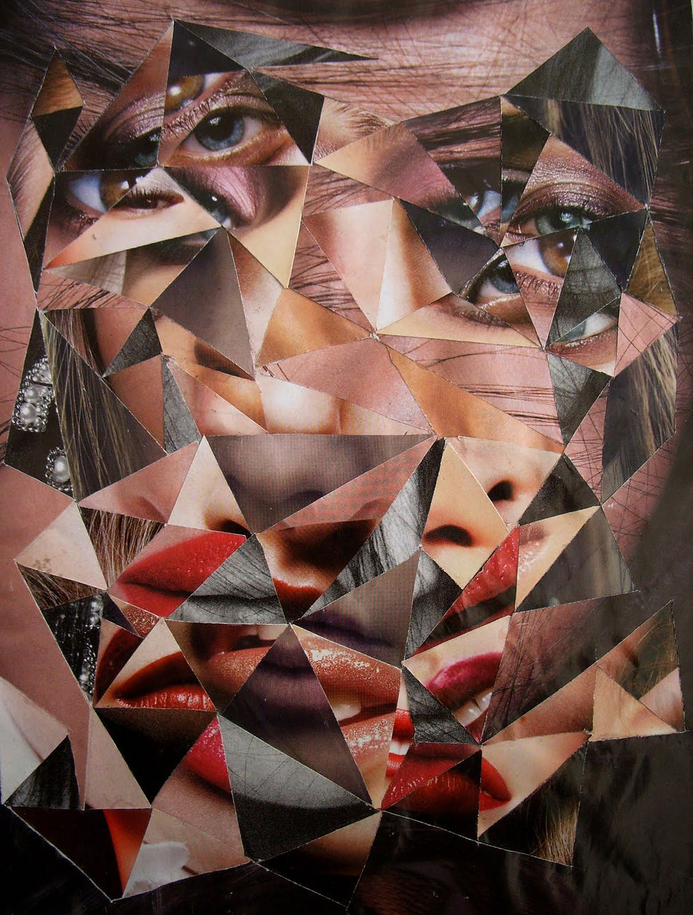
contact sheet:

'Destratos'
This particular piece by Simoes was especially fascinating to me and immediately caught my eye. It seems he has taken a portrait of a man and changed the hue of each layer before cutting out certain areas and placing them on-top of each other to create abstract 3D collages. His use of organic (curvilinear) lines is quite disorientating and strange to look at, as well as the numerous different colours, which are quite emotive in their symbolism - the warm hues, although they are aesthetically pleasing, have connotations of anger or passion. These physical characteristics of his work, when combined, are emphatic in representing the key ideas behind his work: the impossibility of representing an identity or person in one photograph. As well as this, it clearly relates to the theme of identity by showing the several layers to one's identity and the complexity of each individual.
"red reminds me of heightened emotion. the gradient from light yellow to deep red shows how quickly emotions can escalate, from something unimportant to something really big: anger, passion, love..."
In a 2013 interview with 'Redefinemag', Lucas Simoes describes the process and thoughts behind this particular image. He says, “In this series of works, I invited intimate friends over to tell me a secret as I took their portrait. However, my intention was not to hear their secret, but to capture the expressions of each one at the moment they revealed their secret. I also asked each one to choose a song for me to listen to in my earphones while I photographed them. And, after the photo session, I asked each one if the secret had a color, and these are the colors the portraits carry. From this photo shooting session, I chose 10 different portraits to cut and overlap.”
This approach was so unique and interesting, and potentially why his work is so successful in portraying strong emotion. It adds a personal touch and allows him to connect with the people he photographs on a more intimate and intellectual level, which undoubtedly is reflected onto his work and makes it more emotive. I will use this approach to guide me as I do my own shoot.
Personally, I really like his work. As I mentioned before, his use of colours and shapes are fascinating and inspiring both artistically but also in their message. His views on identity and his realisation that everyone is so complex and multifaceted it would be impossible to represent it all in one image is equally as interesting and undoubtedly whhy his images are able to capture so much beauty and detail.
Photoshoot Plan

This is the photoshoot plan for my Simoes photoshoot. I included aspects such as lighting, background and composition to ensure that my images end up the way i want them to. This is important as i need good images for future physical processes, so i will refer back to this throughout the project to achieve the desired end result. I included Lucas Simoes' own images to remind myself of what his work looks like and how i can aim to create similar pieces.
Contact Sheet


This is my contact sheet for my first shoot. I would say it is generally successful as the lighting is natural and even, creating a good base layer for future editing and collaging. To take these portraits, I asked each person to think of something that made them feel a strong emotion. Then, I asked them to associate a colour with their emotion. This was inspired by Simoes' own shoot and is the focus for my later edits
Initial Colour Developments:


"red reminds me of heightened emotion. the gradient from light yellow to deep red shows how quickly emotions can escalate, from something unimportant to something really big: anger, passion, love..."


"blue is the colour of the ocean. while it had connotations of peace and calm, it reminds me of more personal experiences than that"


"green tends to have more negative connotations like jealousy or even greed, but for me, i think of nature. the colour itself is really calming and emotive"
Inspired by Simoes himself, I asked the people in my shoot to describe what feelings they felt as they pictured a certain colour. I then edited their images using simple colour layers of their chosen colours, adjusting the saturation each time to create a gradient effect. This meant that when I go on to layer these photos physically, there will be added depth and detail. I really liked this approach as it was different to anything I've done in my previous shoots and it allowed me to establish more personal connections and understanding to the people I photographed as well as, hopefully, successful and interesting developments.
multiple layer collages:


These are the physical edits of my coloured images. I printed them out and and cut different shapes to create gradient layers and interesting patterns. I really like how these turned out, despite being quite difficult to make, I think it was worth it. Some are more successful than others due to the size of each pattern and the distance between each one- when creating the last two i learnt that it was most effective to keep the gaps narrow and fill the image with patterns rather than small individual sections. Nevertheless, I like all of them and i think they all represent something quite interesting with meaning behind it.
process:


To create these layered developments, I printed each coloured image and began by cutting out relatively large shapes using a scalpel. I started with the lightest image as I wanted it to be on top of the collage. Then, moving through the gradient, I cut out the same shapes in each picture, slightly reducing the size of each. This ensured that when I put them all together, it created a zoom in effect, moving into the darkest colour. I mostly used quite random and organic lines and shapes to create these as I felt inspired by the curvy and circular motions that are present in Simoes' own work, however, this was quite difficult as sometimes the lines turned out too sharp rather than soft. I tried to limit this as much as possible by going back and editing them at the end, trying to also avoid any white parts of the paper showing.
Developments


Annotation goes here
Experimental Photos


Annotation goes here
Highlighting Success
Annotation goes here
Contact Sheet - Coloured lighting


Annotation goes here
Developments before printing


Before printing, i wanted to experiment with changing the hue and saturation so that i would have a wide range of images and colours to choose from before beginning the physical process. I did this for the two images i had decided to use to limit confusing myself with what images i should collage with what. I like the different colours and it was a good idea to add a variety to make it a little more interesting.
Double Exposure


Then, i double exposed these coloured images by duplicating the layer, adjusting its position on the original image and choosing a blending option which would dissolve the layer nicely into the other one. I also decided to layer both different people so that I would have diversity in the images i used and add an interesting effect. Some of these are really successful due to the placement of the layer to add more depth.
Highlighting Success


These are my favourite double exposed images as they were the ones that blended best with the other layer. The positioning in each image is the same, but the hue changed to create different coloured images. I will print these to go on and collage them physically.
Physical Layers