IDENTITY

“Ultimately, a good photograph is one that brings us face to face with our own existence. It pulls the stranger standing next to us into the intimate radius of our life. It collapses the beauty and strangeness around us into one. It connects. A good photograph does all these.”
JOHN CLANG
his work:


about the artist:
John Clang is a photographer and visual artist born in Singapore in 1973. From a poor and under privileged background, Clang earned his Master of Arts Fine Arts from LASALLE College of the Arts in 2015. Well before that, at 20, he had participated in his first exhibition in Singapore having done an apprenticeship with Chua Soo Bin. In 1999, he moved to New York where he was represented by Art + Commerce from 2002 to 2007. Now 48 years old, he is one of Singapore's most sought after commercial photographers, with Singapore Art Museum acquiring his work for their permanent collection.
Unusually for a photographer Clang has stated that he doesn’t carry a camera when he walks through cities in search of inspiration. He explained that “I walk a lot and along my walks I never bring along any camera, I’m a strong believer that if I see something amazing in front of me, something that happens in front of me, I do not take a picture, what I want to do is observe, to hear, to sense and to be in the moment, because it’s embedded in my memory itself. Only then, when I create my art I can reflect those feelings. So it’s a strong policy that I do not carry any camera to take any pictures at all.”
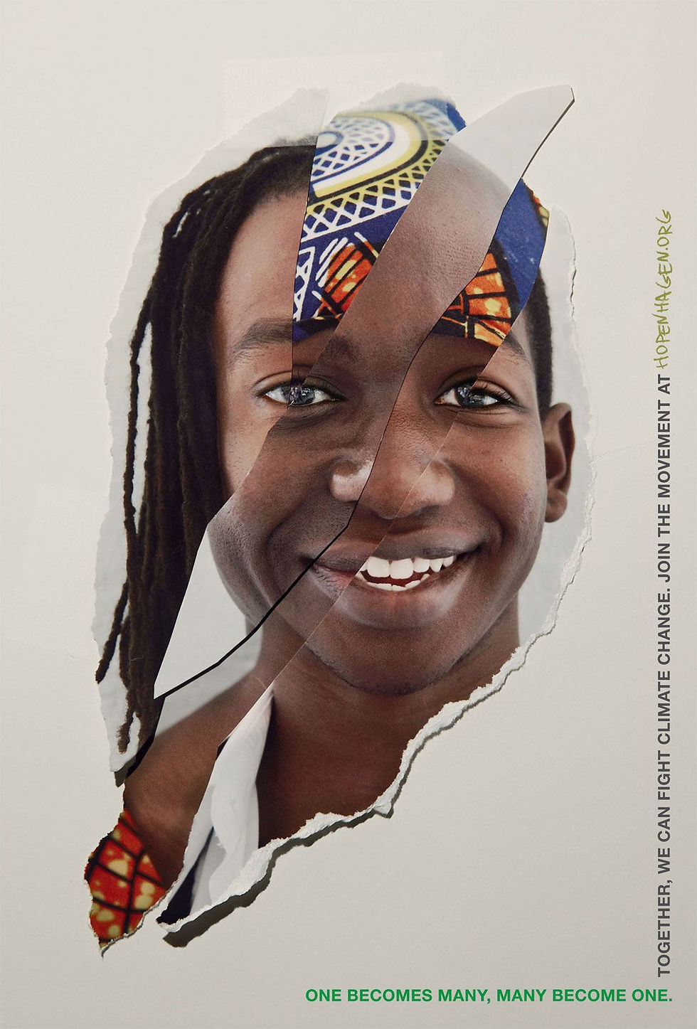
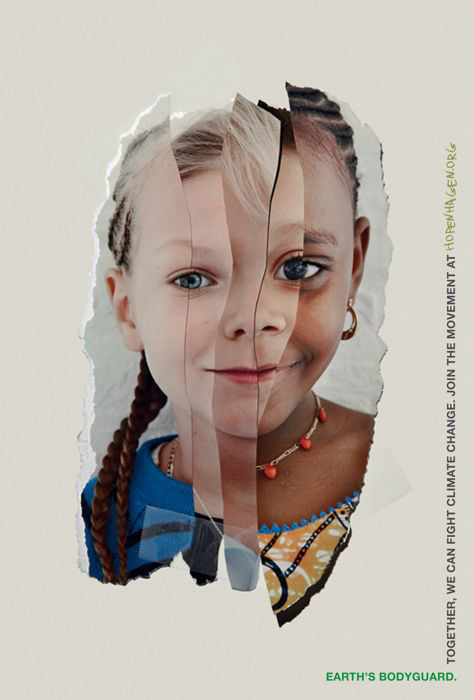
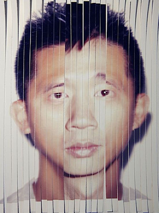
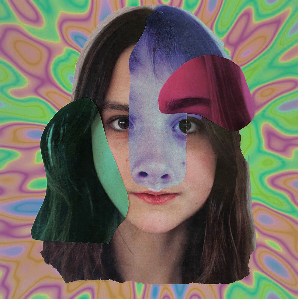
In terms of his work and its contents, he explores the theme of identity in unique and powerful ways, experimenting with different settings, people, races and ages, as well as mixed media to create interesting pieces with deep meaning. Specifically, he takes close up shots of different people, collaging and layering them to create the effect that they are one single face. This represents identity in showing that every person is a collection of many different experiences and characteristics. He follows the same process when creating his images in urban and populated areas, editing on different cut outs of people and layering them onto an original photograph.
He takes his portraits in what seems to be natural lighting as it is very even and they lack shadows. They are also taken in portraiture mode generally following the rule of thirds to centralise the faces although this is not obvious nor necessary as they are layered in the end. All his images have the same simple background and tones, and there are no particularly harsh or contrasted areas. Clang uses both traditional and digital photography and, more recently, having expanded into Film, he has begun to use stills from moving images.
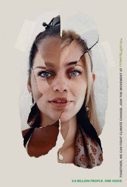
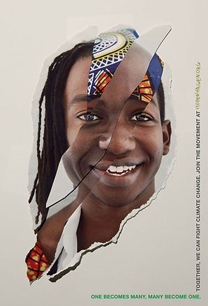
His 'hopenhagen' piece in particular is fascinating in both its imagery and symbolism as it combines cultural and hidden identity in an aesthetically pleasing and creative image. The different layers used for the collage on the right, as well as the patterns which add colour, detail, further develop the theme of identity and portrays the way people are made up of so many different parts and identities, and the many ways to express it. The colour scheme and tones are soft and pleasing to the eye and work well to draw attention to the face itself and all its detail. Ultimately, it allows viewers to reflect on the complexity of ones identity by associating the physical collages with metaphorical ones of our characteristics, experiences and other factors.
Personally, I really like his work. The colours and details are aesthetically pleasing and interesting to look at, as well as portraying complex ideas about hiding your identity and what makes us up as people. If I could ask Clang one thing about his work it would be the inspiration behind it. It would be interesting to know what inspired him to explore human identity and the execution of his ideas in terms of the faces and collages. I will use key concepts from his work when developing my own images to incorporate some of his fascinating themes even the photography itself.
photoshoot plan:
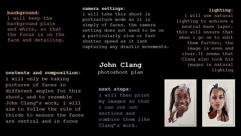
This is my photoshoot which i made so that i am clear on what i need to keep in mind while shooting and editing. I will remember to refer back to it so that i achieve the images i want.
contact sheets:
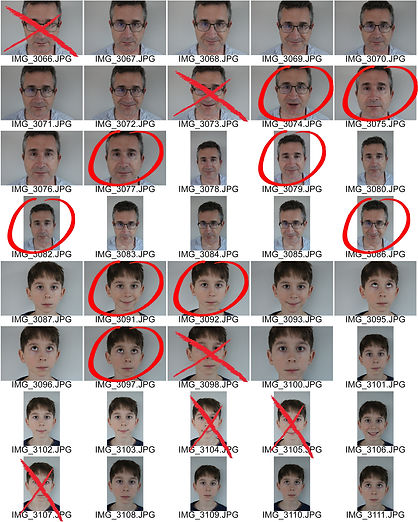


These are the images from my initial shoot, which was mainly taken at home with my family, although I took some at school for a variety of people and faces. I like how most of them turned out as the lighting was consistent and generally soft. There is also a lack of shadows which is helpful when editing these further. Some were less successful, however, due to the clothing of the people and certain settings which created uneven or dark base layers. The background is also plain and therefore helpful for simple first images. Overall, I'm happy with how they turned out and I'm excited to develop them further.
initial edits:


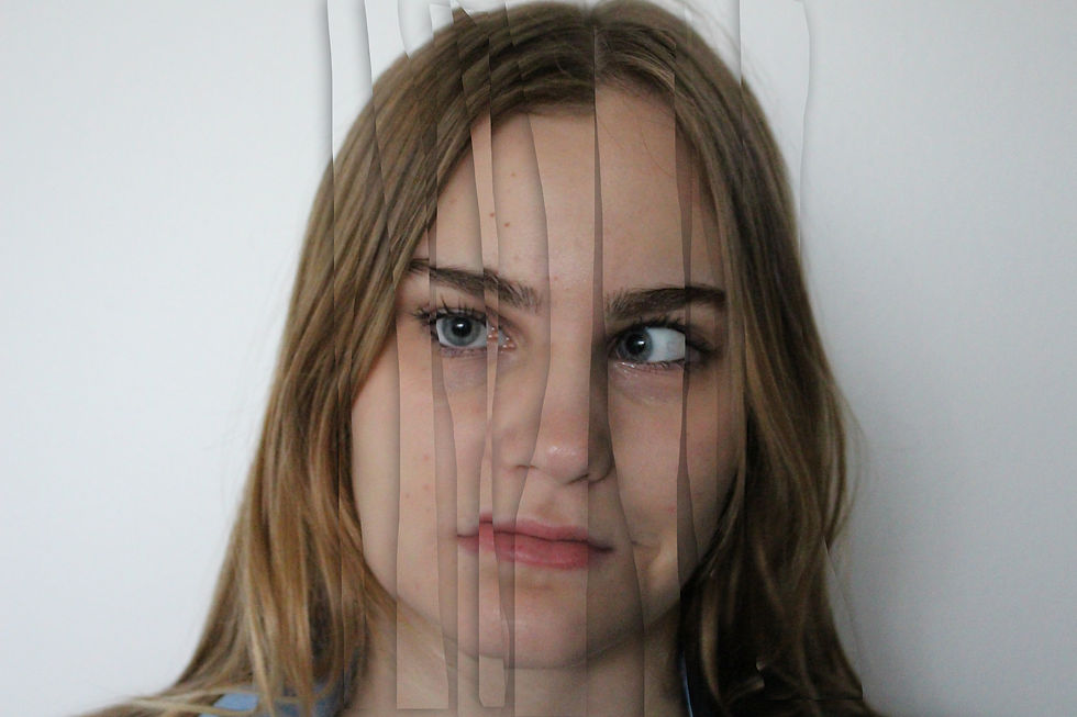


These are the first digital collages of my images, which were made using Photoshop and layering the different facial features to create distorted and somewhat strange imagery. For some edits later on I decided to try to create shadows for further texture and detail, and because Clang's own work incorporates this, using the layer tool which was quite successful, although it does not necessarily look very real. Again, I wanted to create some edits electronically before printing and collaging physical photos so that I could have a sense of how I wanted them to turn out and which images were more successful to develop further. This seemed to work well and some of these are successful due to lighting and the contents of the pictures themselves, however, some were less successful as the features do not match up very well and therefore do not create the effect that they are one face. I will keep this in mind when doing my physical edits to ensure that I choose the features that match up well with others.
highlighting success:
These are my favourite first developments as i feel that the features seem to match well and ultimately create a realistic face. The less successful edits were those that seemed too distorted and uneven to resemble a face, and while this could be a cool concept, my aim with these developments was to somewhat mimic Clang's work; his images combine different faces to create one coherent image. I am happy with the subtle addition of shadows in the first two, this gave the impression that the cut-outs really were layered, yet they are not too dark and harsh.
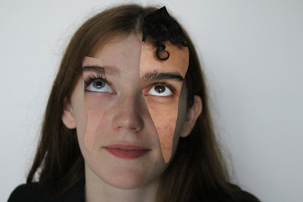
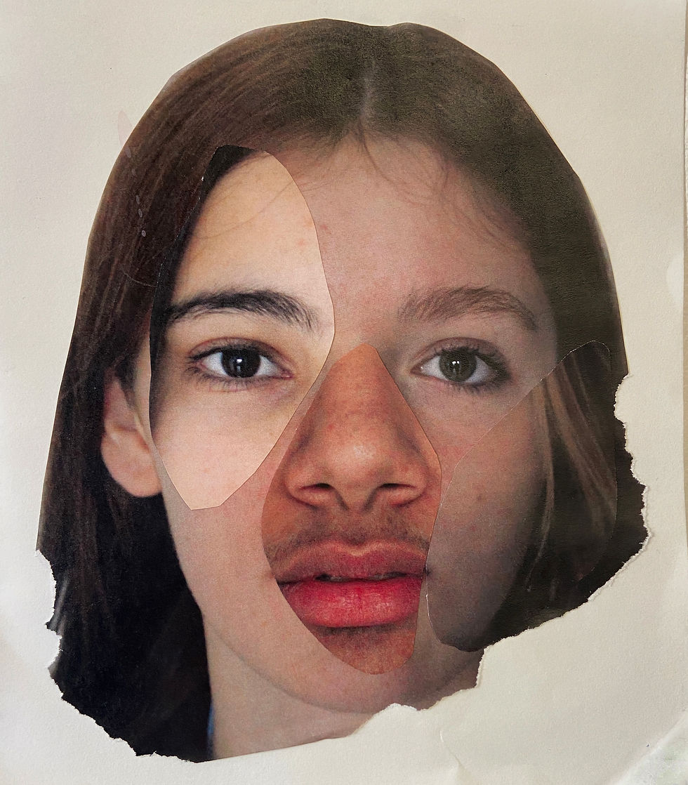
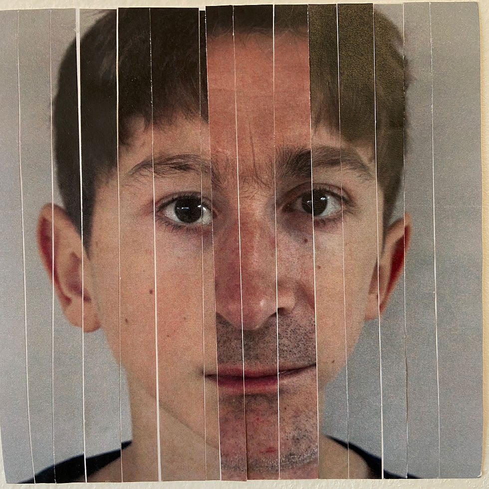
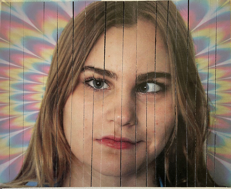
physical developments:
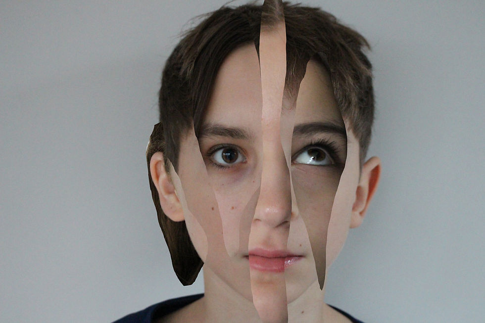
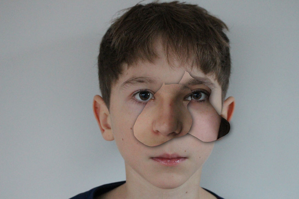
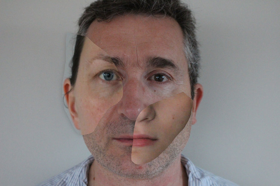
These are my physical developments, which were made by printing my original images and cutting out certain facial features in order to then layer them together and merge into one face. This was quite difficult as my aim was to create realistic faces, however, it proved to work well especially because the images used were generally taken in the same lighting and camera settings, therefore creating even and similar base layers. I'm happy with how these turned out and am curious to see how i can develop them into my own as they are currently very similar to Clang's own work.
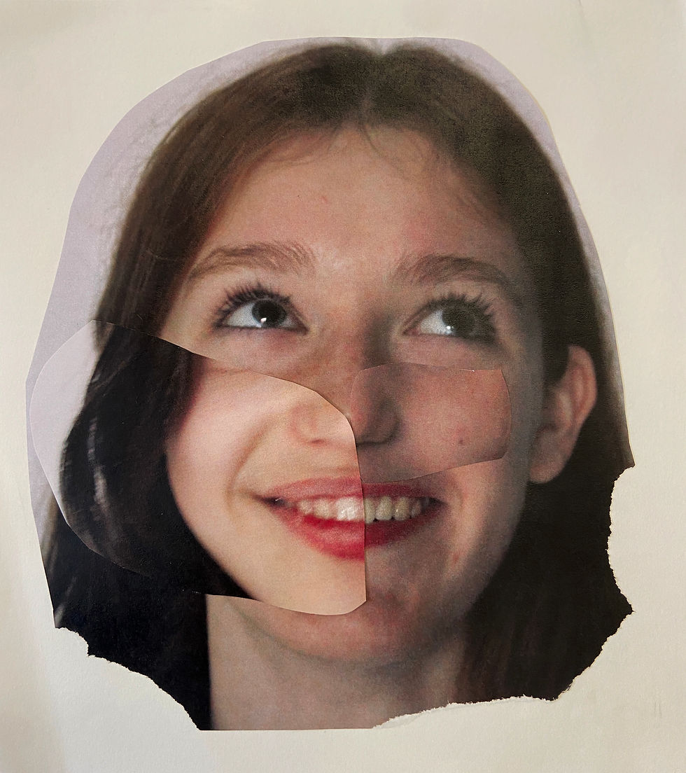

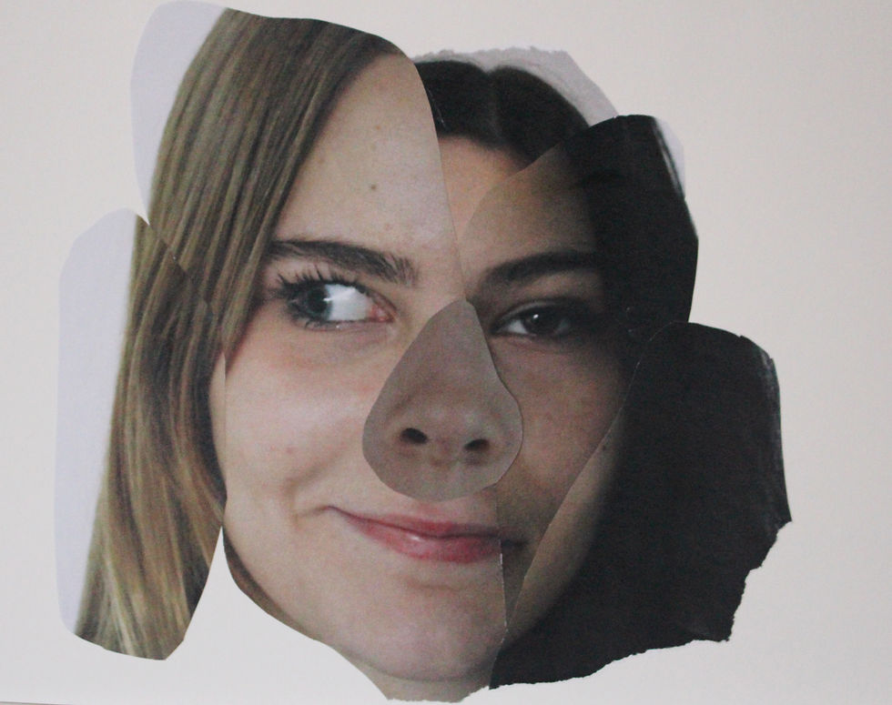

highlighting success:
These are my favourite physical developments as i find they are the most coherent and realistic faces. The features combine nicely to create interesting images and represent more complex ideas about different skin tones, features and ultimately one's identity. The cut outs are emphatic in showing how everyone is made up of many different aspects accumulated throughout life, which is why i really like these photos.
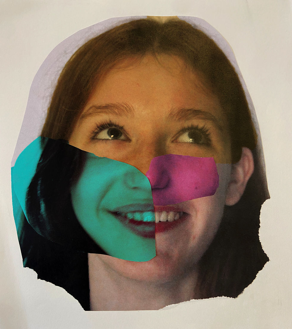
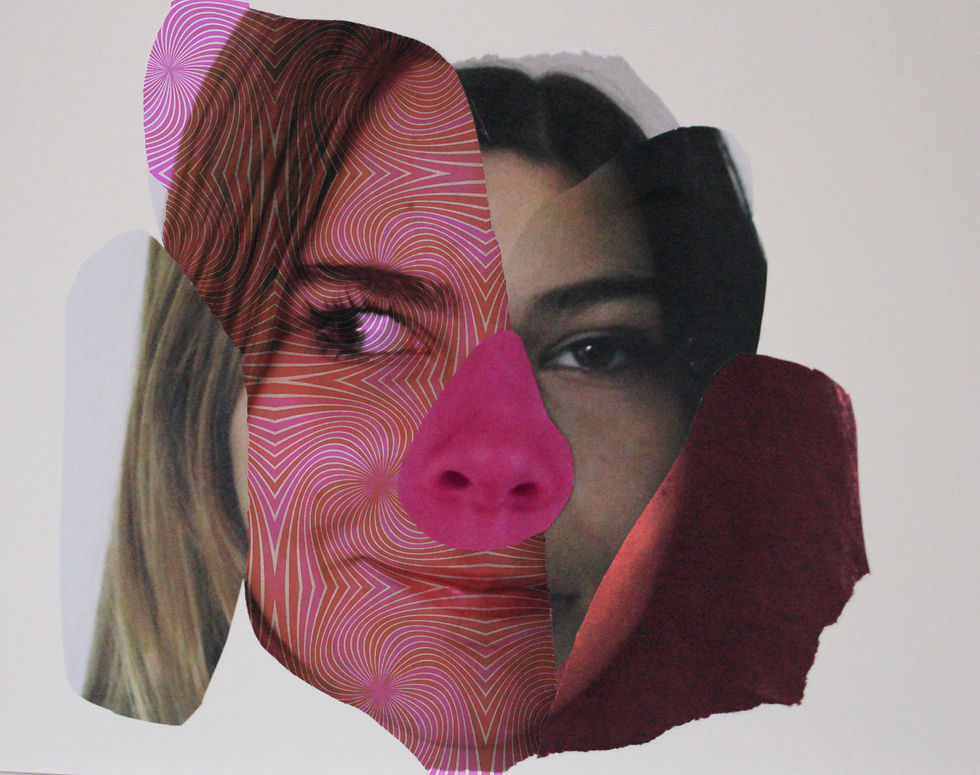
experimenting with colour:
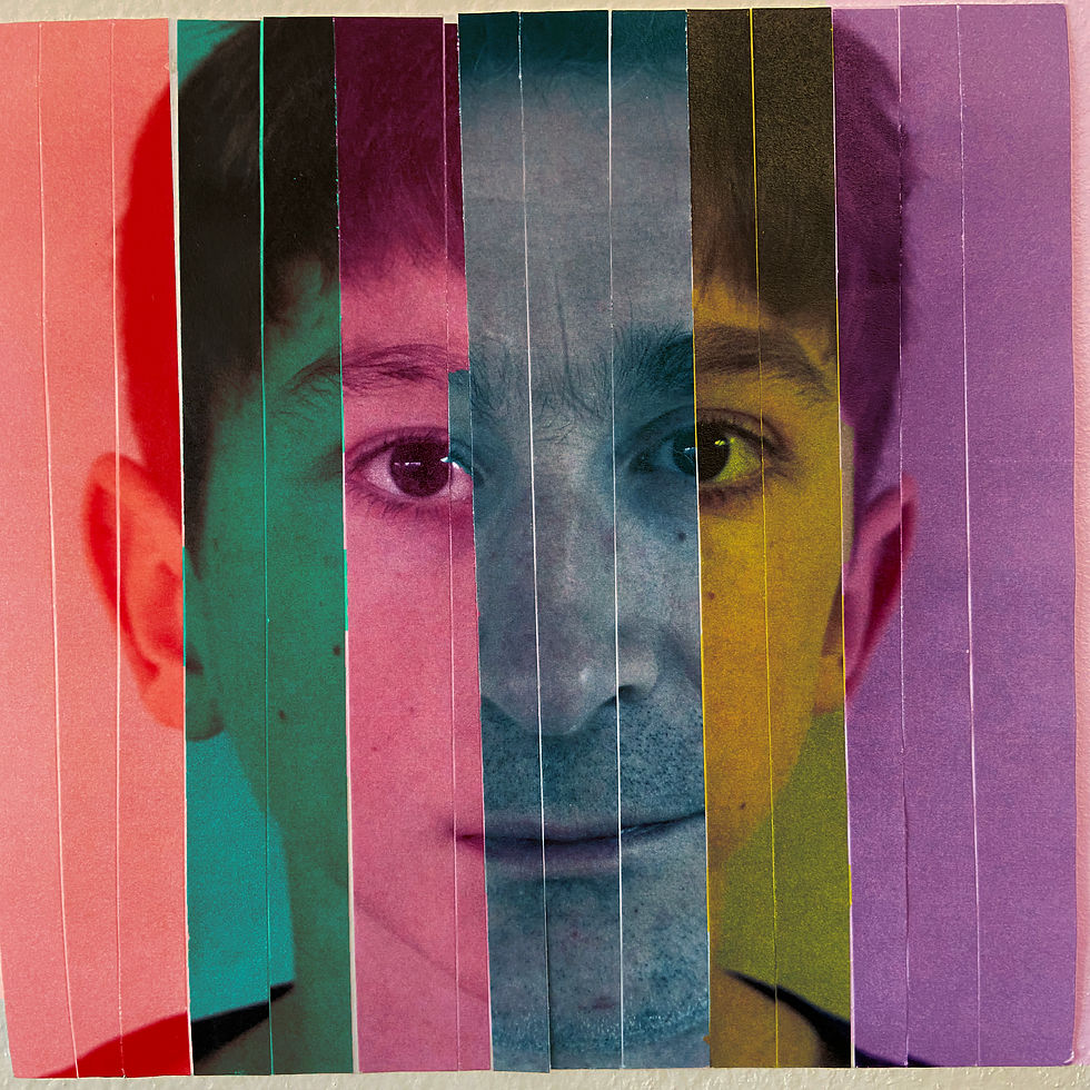
I wanted to use the physical images to develop my work and incorporate my own aspects into it. Colour is an interesting way to transform images and add depth and detail. The cut outs also meant that I could easily create separate 'chunks' to split into different colours, so i played around on photoshop by creating different layers and adding colour to them. I added overlays to the background to add detail and more include more patterns (generally random, organic shapes). This seemed to work well and i like the more vibrant and creative feeling that these images portray.


process:

For these edits, similarly to my other artist, I created separate layers on Photoshop out of the physical layers. Then, I added different colours to each layer by dragging it using the 'alt' key and applying it to the single layer. This worked well to use different colours, and by adjusting the opacity and hue I created the effect I wanted without making the colours too overpowering.
highlighting success:
These are my favourite coloured developments as the colours blended really well with the features of the faces, so that it almost looks as if the colours were there in the original image. This was the desired effect and why these are most successful, although all the images were also ideal for these developments
exploring materials
transfers:

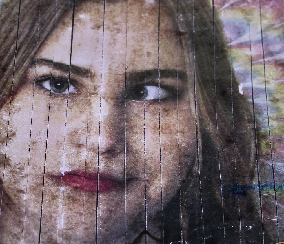

To develop my work, I wanted to experiment with more mixed media to see how I could represent the different elements in my work. I used several materials such as tape, acetate, wood and fabric which all slightly changed how these images were presented and overall, I'm happy with the results. Although the quality of these images is not perfect, despite taking them on a light box, I like the grainy, blurry effect that it gives them and ensures that they look different to my initial edits. The image transferred onto wood was particularly unclear as it was difficult to remove the paper after drying and the material itself is already more uneven than the others. Nevertheless, it was worth an attempt and exploring how the different medias would reflect the images was an interesting process.
process:
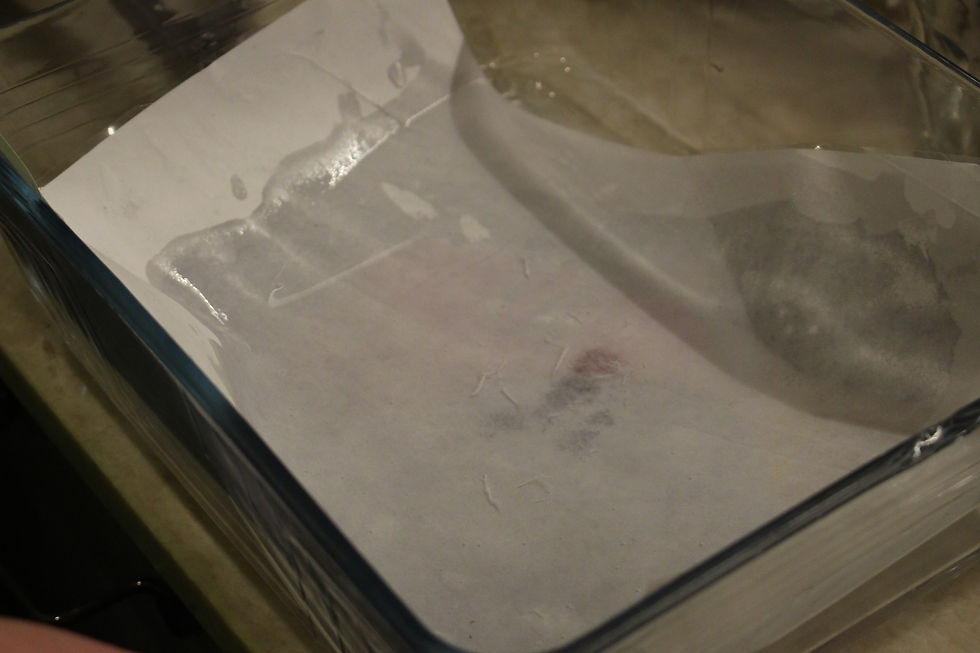

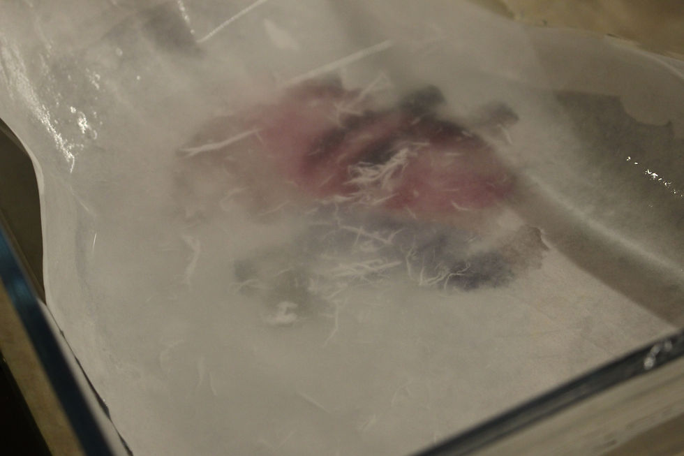

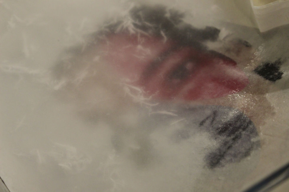

To create these developments, I covered the chosen images with pva glue and then stuck them face down onto a piece of acetate, in hope that the ink would transfer onto the material. Once the glue had dried fully, I placed the image in a container of lukewarm water so that the paper could dissolve slightly and I would be able to rub it off. This generally worked well and I was able to remove the paper layer in circular motions and was left with a piece of acetate with the image transferred onto it. Although there were some gaps in the image due to the uneven layers of glue, I like how they turned out and the imperfections add an interesting touch to the images; the aim was not to create perfectly clear transfers but rather to experiment with how I could present my work on different materials.