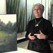
Catherine Eaton Skinner
Catherine Eaton Skinner is a multi-media artist who works both with photography and painting to create pieces of simple tantric forms to complex grids, as a reflection of humankind's attempts to connect to place and each other.

Artist analysis
.jpg)


Catherine Eaton Skinner, born in 1946, is a multi-media artist who works both with photography and painting to create pieces of simple tantric forms to complex grids, as a reflection of humankind's attempts to connect to place and each other.
Having grown up in the Pacific Northwest, Skinner was surrounded by nature all her life, which strongly influenced her art, and became a key theme in her work; Skinner’s parents taught her and her sister about their environment, the art of the Northwest mystics, and encouraged creativity with a variety of available materials. When Skinner realised how well she was able to reproduce what she saw, she decided to focus on illustration and took art classes while working on her biology degree. At this time, the San Fransisco Bay Area Figurative Movement was popular, a movement that moved from abstract expressionism to focusing on the figure - a movement that still inspires the artist. Skinner then worked in her first professional artist occupation for twenty years at Stanford University, illustrating for the Biology Department professors. For a while, her illustration work concentrated on marine invertebrates and algae for field guides, books, graphics and research papers, and then began to be exhibited, as Skinner took weekend art workshops and experimented with a variety of mediums. In 1990, she moved to Seattle and began working with art full-time, using her skills in graphic design, biological illustration retail work, and ‘island life,’ and explored colour and texture as well as the simplicity and complications of abstraction. Skinner shared that travelling increased her knowledge and visual cultures, and is attracted to places of worship and natural sites where people seek a deeper relationship to locatons of metaphysical power - cultural memory lies within the physicality and history of a place. Through her art, Skinner explores themes such as the symbolic number 108, a number ‘rich in arithmetic power and numerological symbolism associated with Eastern religion and philosophy, and which she named her book, published in 2016.


"My use of repetition and primal tantric forms allows both the artistic and spiritual dissolution of myself into the universal whole. This then becomes my connection with the collective thought and heart of all sentient beings" - Catherine E. Skinner

Moreover, Skinner focuses on the elemental archetypes of the physical and cosmic world (water, ether, earth, fire, wind, woods). This notion is reflected in her use of medium, as Skinner uses materials such as beeswax, resin, graphite, oil paint and oil stick, stones, lead sheeting and precious metal leaf, textiles died with natural materials, old book pages, and hand-made papers in her work.
Now, Skinner divides her time between studios in Seattle and Santa Fe and works full time as a multidisciplinary artist in oil and encaustic, printmaking, photography and sculpture. The artist had over 39 solo exhibitions, including the Royal Academy of Arts, and over 100 publications have highlighted her work in feature articles or cover artwork. Public collections of her work include the Embassy of the United States in Tokyo, and several universities and museums.
Personally, I find both the work, and the story of Catherine Eaton Skinner fascinating - I have a personal interest in her work illustrating organisms such as marine invertebrates and algae, and I am very interested in her experimentation with a variety of materials. Her artwork has a profound meaning and demonstrates lots of depth and significance.

This piece, titled "Stacks IX" was made in by Catherine Eaton Skinner in 2017.
My immediate reaction to this image is curiosity - what is this an image of? Upon closer inspection and with the clue of the title (and the rest of the art series), it becomes evident that this piece features, or is inspired by, a stack of books. All the same, the close up of the pattern leaves the viewer confused and intrigued as there almost lies an image within the spines, but not quite. This notion, as well as the general appearance of a horizontally striped pattern is reminiscent of the work of Gerhard Richter, a German visual artist well-known for his 'Strip paintings'
Moreover, I enjoy the pattern of this image - the work features regular stripes, and yet the use of colour and texture had prevented the piece from becoming too boring. The element of mystery, as viewers initially question what the work features, is also intriguing.
.jpg)
As this image is a painting (made using oil sticks), it is difficult to determine the conditions of lighting. There are however, prominent shadows (though there is no specific direction of lighting used) and the hue of the light is a soft warm colour, thus, perhaps inspired by natural light. Overall, the piece is rather grainy and textured, so if it was a photograph, one could assume a high ISO had been used, or could be used to mimic this image.
The focus of the image seems to be the pattern of horizontal stripes - this is the most clear and evident part of the piece. These lines are emphasised as the shadows of the image are mainly below these stripes, which also gives the image a 3D element. Thus, these stripes are the most prominent dominant lines of the image, and the repetition through the whole of the piece creates a pattern.
The use of shadows in this piece creates a 3D effect, as viewers can imagine the texture of the books and paper, and thus, the image also has depth. There is also a range of tones from dark to light, with few midtones, and a varied use of colour. The image has some red and orange shades, that seem slightly out of place, yet simultaneously work well with this image, as they are reminiscent of the tones of colour of old pages, further likening the image to a pile of old books.
The image is not very intense, perhaps due the material manipulation of the artist. Skinner often works with opaque or transparent wax on her images, layering, scraping and fusing, and combining this with waxy oil sticks or thin staining colours that are melded into the wax; this back and forth of layers and opposing colours 'adds to a feeling of memory or dream', as the original image - often a photograph - is hidden beneath the layers.
Skinners work also has material significance, as she utilises papers and tissue and silk collected from her world travel, thus creating a sense of fragility, further emphasing the notion that the image features a stack of old books..


Photoshoot plan

The first step in developing and creating my work for this artist was to do a photoshoot; for this, I created a photoshoot plan. This will be useful for my photoshoot, as I can reference to my notes for my chosen camera settings, before my shoot for how to best set up everything, and decide which compositions I should try.
For my photoshoot, I am going to photograph several antique books, stacked over each other, in a variety of compositions, which I will use as a basis for my developments.
My photoshoot will take place indoors, where I have access to a warm light that will emphasise the age and colour of the subject books. Prior to my photoshoot, I will have to source and select which books I will use.
With my plan, I can make my photoshoot as efficient as possible, and avoid any problems.
I will be taking images more general than the artist, whose series 'Accumulations' features more close up images of stacked books
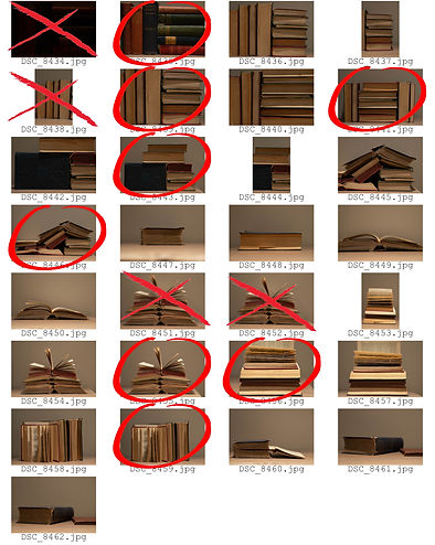
Contact sheet
Overall, I think that my photoshoot was successful, though I did not take many images - only 29. My plan was useful, as I used this to organise the books into a variety of compositions, as well as select the appropriate settings for my camera prior to taking images (though I altered this slightly during my photoshoot, so that my images would be well lit and not show too many shadows). During my photoshoot, I also moved the subject books forward, to avoid casting shadows on the wall behind, and my initial photo was too dark, so I increased the light.
after my photoshoot, I collected all my images into one contact sheet and annotated this. This gives me a better overview of my photos, and will make it easier for me to develop my work further on, as I can easily reference to my photoshoot and select the right images. On my contact sheet, I used a cross to mark unsuccessful images - in this case, my unsuccessful images were too dark, demonstrated a poor composition, and featured too many shadows. I also used a circle to mark the most successful images I took, that I will develop further. These ere the images with the most interesting compositions, with little shadows, and good focus.
This photoshoot developed my understanding of using a variety of compositions in my images, and the use of warm and cold light. I was able to apply my knowledge of lighting to avoid shadows from my previous artists.
To improve my photoshoot, I think I could have taken more image, as I have less to choose from for now.
These images will be edited and then become a background for my developments. They relate to the artist due to the perspective and subject matter.
Too Shadowed
Too dark
Poor composition
Changed #8455 to #8454 as it was not in focus
Initial edits
I edited my images, using my contact sheet to select those that I thought had potential. In photoshop I cropped my images and rotated them so that prominent lines were parallel or perpendicular to the bottom edge of the image. I then adjusted the curves and levels so that my images had the right lighting tone. Then I used the burn and dodge tool to draw attention to particular areas. This resulted in my images being more dramatic and a more harmonious colour scheme.
I think that this process has made my original photographs more interesting.
These edits remind me of the work of Catherine Eaton Skinner, due to the focus and composition of the stacked books, as well as the dark, dramatic fell of the images. These images remind me most of her messily stacked book works.
I think my images are generally successful, and I like the compositions I used (as planned in my photoshoot plan) but will look more like the artists work when I crop them.


To develop my images further, I decided to crop the edits, once I was pleased with their levels and colours. So, I took my initial edist and simply cropped them further. Thus, I created several images from a single initial edit.


Therefore, I created these 20 further edits by cropping my initial edits.
This reduced negative space around the books, and zoomed in on the patterns, as the background was less evident in these images. This also made my images more relevant to the artist, and more applicable for use as a background, as there are less distracting features in the images. Thus my images are more successful as they are more similar to the artist and demonstrate bolder lines.
I like the pattern of these images, as they appear almost geometric, but the gaps and angles emphasis the imperfection of the books.
I then decided to take my images a step further, and crop them even more, to focus on smaller line patterns, which are evident in Skinner's work. This zoomed in effect meant that it is harder to tell what the images are of - I find this a successful feature of my images, as this was my initial reaction to the artist's work.
One challenge of this process, was that areas of the images would be out of focus if I zoomed in too much.
I think the images with regular parallel lines are the most successful.
These will also be effective backgrounds for developments.


Highlighting success


Of my initial edits, I chose those that I thought were the most successful
Further intiial edits
Anno


Cut into squares, alternates images in grid
Weave tracing paper with standard paper for alternating overlay effect.
composition experiment


