
David Hockney
David Hockney, (born 9 July 1937) is an English painter, draftsman, printmaker, stage designer, and photographer. As an important contributor to the pop art movement of the 1960s, he is considered one of the most influential British artists of the 20th century.
Artist analysis
David Hockney, (born 9 July 1937) is an English painter, draftsman, printmaker, stage designer, and photographer. As an important contributor to the pop art movement of the 1960s, he is considered one of the most influential British artists of the 20th century.
David Hockney was born in 1937, and is considered to be one of the most influential British artists of the 20th century. The artist, who has worked as painter, draftsman, printmaker and stage designer along with photography, is an important contributor to the pop art movement of the 1960s. David Hockney was born in Yorkshire, and was raised there along with his four siblings. He then went on to study at the Braford School of Art from 1953 to 1957 and the Royal College of Art from 1959 until 1962, when he was awarded the Royal College of Art gold medal in recognition of his mastery as a draughtsman and his innovative paintings. Hockney has owned a residence and studio in Bridlington and London, as well as two residences in California, where he has lived intermittently since 1964. Over the years, David Hockney has been featured in over 400 solo exhibitions and over 500 group exhibitions, and has held several records, including ‘Most expensive artwork by a living artist sold at an auction’, from 1972 to 2019. Hockney was offered knighthood in 1990, but turned the offer down, saying “I don’t rate prizes”, and that he “does not care for the fuss.” He did however, become a member of the Order Of Merit by the Queen.
In 2011, David Hockney was voted the most influential British artist of the 20th century, According to a poll of 1,000 British painters and sculptors. The artist had a major influence on the pop art movement, inspiring many other painters, photographers, sculptors and more.
Hockney himself, was inspired by a artists such as Picasso, Matisse and Fragonard, and liked to depict his close relationships with the real people in his life
In general, Hockney’s artwork and interest in pop art was about making art more accessible, and less boring, therefore using bright colours in many of his works.


Image analysis
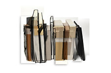
This image, simply titled 'Chair', is a photo collage made by David Hockney in 1985.
My immediate reaction to seeing this image is a sense of confusion - the image appears wrong in many aspects and yet simultaneously surprisingly right.
I believe this image has a certain similarity to the art movement of cubism, which was a revolutionary new approach to representing reality, invented in around 1907–08. This style featured different perspectives brought together in a single image, resulting in pictured that appear fragmented and abstracted.
This style and notion have resulted in my interpretation of the image that a whole new perspective can be gained when something is approached from a variety of angles and that there are many ways to approach something.
Personally, I like this image as it is creative, and has turned what appears as an ordinary domestic item, as simple as a chair, into a unique, abstract, and intriguing piece.

One can assume that - due to the warmth of the light, shadows, and background - Hockney used natural outdoor lighting when taking the images for this piece. This use of daylight not only results in a warmer hue and temperature of light but will also have given the artist little to no control over the shadows evident in his images. I believe that Hockney also used a small aperture of at least f/11, which results in a large depth of field, as indicated by the fact that everything in the images is in focus; however, the chair is still obviously the focus of the piece, though this has been achieved via composition, not aperture and focus variation. The shutter speed that Hockney used is difficult to decipher, as no motion blur is evident and the subject is a stationary item, and the artist most likely used a medium ISO, as the image is not very grainy. Hockney can have manipulated these camera settings (shutter speed and ISO) to balance the daylight as he could not adjust the lighting, to prevent an over-exposed image.
Within each separate photograph, there is not one area that is sharper than another - the background is also in focus - however, the central positioning of the chair in general within the piece, causes this to be the focus of the work, and viewers are immediately drawn to inspect this subject. The use of daylight here has resulted in a warmer hue of light, though not so warm that one can assume that the pictures were taken during the 'golden hour'; Hockney most likely photographed at midday, on a sunny or lightly cloudy day. This natural lighting also is soft, so the shadows are not very pronounced and sharp - nevertheless, shadows are evident particularly in the bottom right of this work, where Hockney has collected the images with larger shadows and joined them together in such a way, that the chair appears to have one large shadow despite the collection of a variety of perspectives and angles. Different areas of the chair also demonstrate varying amounts of light, for example, the legs of the chair are darker than the seat.
I find the composition of the collage impressive - Hockney has gathered his images in such a way as to still create the appearance of a single chair, though abstract. The lines of each single photograph join up well with the next, causing a sense of unity, and a pattern that mimics the actual object's aspect. These bold lines joining well roughly distract viewers from the imperfections where images do not join well. This composition of the montage also creates a very three-dimensional effect, as though Hockney has photographed a simply strange chair. On the whole, the piece displays depth along the chair, due to the use of lines, and little negative space surrounding the subject.
Viewers of this work can easily imagine the feel and texture of the chair due to the detail and sharpness, as well as natural shadows, that clearly portray the texture of the material. The piece demonstrates colour, in a variety of tones - the image exhibits both a high proportion of highlights (some of the seat of the chair and background) and shadows (legs and back of the chair), as well as mid-tones. However, the colours of the piece appear muted and not too saturated or bold, as this might be too distracting for viewers, and the beige of the background and green of the chair work well together, though do not complement or contrast each other.
The final image has been composed that despite the harmony of the separate photos at first glance, viewers can also immediately see this is a collage of separate images, due to the fragmented appearance of the chair, and lack of uniformity in the placement of the photos - they seem to be piled up and do not result in a neat final edge to the piece, so there is negative space surrounding the actual work, to create a quadrilateral final image.
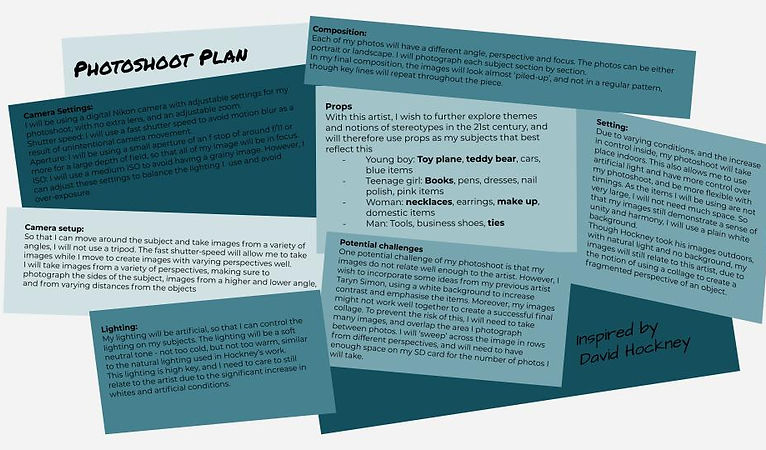
Photoshoot inspired by David Hockney
Photoshoot plan
Before my photoshoot, I created a photoshoot plan, writing out key concepts of my shoot, as well as potential challenges, and notes for me to remember such as camera settings. By creating this, I also could organise my ideas, and explore how I want to take my images in a way that relates to the artist. This plan will also help make sure that my photoshoot is efficient and coordinated, and eliminate or remind me of potential challenges and difficulties. My photoshoot will take place indoors, and I will take several photos of items relating to stereotypes, to create Hockney-inspired collages. I have taken some inspiration from previous artist Taryn Simon, using a white background to create contrast.
Contact sheets
Overall, I think that my photoshoot was moderately successful as I got the images I wanted, but will need to develop my work to see if they are successful enough, as I do not think the quality of the images is great.
Throughout the photoshoot, I referred to my plan, which was mostly helpful in setting up my props, and reminding me of my camera settings and angles. Within my actual photoshoot, I did not vary my angles as much as I had planned because my items were not such complex 3D subjects as Hockney's chair, so I could not create abstract interpretations like the artist. This may be something I will develop in my second photoshoot.


Following my photoshoot, I created these five contact sheets. These will be critical when developing my work in post-production, as these contact sheets allow me to easily view all the images I have taken, annotate which images I wish to develop, and give me an overview of my photoshoot.
When annotating my contact sheets, I used circles to mark which images I find successful, and will use when editing my work, and I used crosses to mark unsuccessful images, which do not have any potential. Generally, I could see that my more successful image were images with regular lighting and not too strong shadows, as well as useful angles, whereas my unsuccessful images, many of which I crossed out, were of a poor composition, and too shadowed.
Upon reflecting on my photoshoot, I learnt that my subjects do not have the same 3D effect and bold lines as Hockney's work, so my collages will not be as abstract. I now understand that, in order to create more successful image in my next photoshoot, I need to choose larger items, with more depth, and vary my angles more.
Now, I will take the images that I have marked successful, and develop them in photoshop, and edit together my photos into a larger collage, like the work of David Hockney.
Initial edits
The next step in post-production, was my first developments and initial edits. I edited my images one object at a time, starting with an image showing the object as a whole, and then different sections of that item. Thus, I created several edits for each item, which I can compile to create collages.
When editing my photos, the most significant change was cropping my images, so that each photo focused on a particular area of the object. In photoshop, I also adjusted the levels, saturation, and lightness of one image, and copied-pasted this onto the other photos of this object. This helped to lighten the background. Then, I made more minor changes to my photos, separately, utilising the spot heal tool, as well as the burn and dodge tool. As a result, I had many smaller photos of one larger object, which were not too distracting or boring. For some images, I also used the paintbrush tool to extend the white background, around the area of focus. However, I did not do this on all my images, as I knew some areas would be covered by other photos in my collage.
My edits are inspired by the works of David Hockney, as I have taken images of different areas of of each object, to bring together in a collage.
I also think my edits link slightly to my previous artist, Taryn Simon, due to the white background and resulting contrast.


The first object I developed, was a toy plane, linking to the stereotypes present in children's toys.
I started with my base image, and then worked on each area separately. Some images have areas that are blurry or show unwanted background (not white), however, these areas will not be present in my collage.
I think that the colours of the object were successful, and the angles will work well together, though the unequal colouration of the background is unsuccessful.
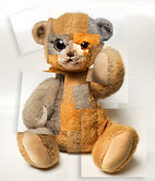
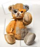
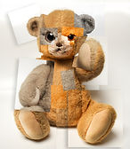
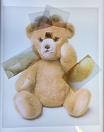
The second set of images I edited, were of this teddy bear.
This was easier to section out into different areas, and I think these will be successful as a collage, as the initial edits worked well. I could use the dodge tool and burn tool well to draw attention to specific areas (e.g. lighten the eyes), and I think that if I make some areas disproportionate, my collage will be more dramatic.
I think these images are successful, as everything is in focus and the background is even.


Next, I create my initial edits of the books. This was more challenging to section, as I did not want to have each area focus on a different book, but rather on different areas of the books together as a whole.
In general, I do not find these particularly successful, or unsuccessful, as I do not find the images particularly exciting, but the background worked well.
Then, I focused on the images of jewelry and makeup, linking to the notions of stereotypical femininity.
I find these edits unsuccessful. as some photos are too dark, areas are not in focus, and I think I sectioned the object too regularly, so the collage will not be successful.
However, the object does demonstrate a variety of colour, which is good.


Lastly, I created my initial edits of the ties, linking to stereotypes about father figures, business men, etc.
The variety of colours and angles was interesting, and will make for a more exciting composition in my collage.
However, I did not have an image of the entire object as a whole. I also think that the coat hanger is too bright in my images.
Highlighting success


Second developments
Developments


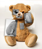
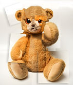
My second stage of development, was to compile my images into collages. I started by using my base image, then layered my initial edits over the different areas., before adding a plain white background layer. Thus, I created five collages linked to the work of David Hockney.
I like how the collages seem distorted. and so mildly surreal. The developments with more layers and images were more successful than those with less.
Moving forward, I would like to experiment with different settings and ideas for my collages. The, after my next photoshoot, I wish to create more abstract manipulations of the object using my collages.
Shadow developments


Next, I experimented with adding a 'shadow drop' to my collages. I decided to only add this effect to some of the images in my collage, as this prevented the image from being too full and distracting. In order to do this, I selected my images from a variety of areas in the collage, and enabled 'shadow drop' on the layer. I then adjusted the opacity, distance and strength, so that the shadows would be visible, but not too strong.
Overall, I think that these developments were successful, as the shadow effect made the collage developments appear more 3D and layered, which is more interesting. I think I successfully chose which image layers should b shadowed, as the shadows are well spaced around the collage, although the opacity is slightly too high in some areas.
Coloured backgrounds


I also experimented with adding a coloured background to the collage developments ( with shadow drops), rather than having a plain white background. To do this, I created a new layer with the colour of my choice, below the collage image layers. In order to choose my colour, I selected colours featured in the subject item, as this would create a harmonious colour scheme, and then adjusted the lightness, and hue mildly to achieve the optimum colour. I also used the colours I selected to further comment on the stereotypes was linking to, such as rthe blue for the toy plane, and pink for the jewelry.
Overall. I think that this experimentation proved successful, as the colours work well with the collage, without being too distracting, and link well to the notions of stereotypes. However, the colours may not be muted quite enough, as they are very bold.
Second developments : highlighting success


Overall, I would say that these are my most successful developments. By reflecting on my work, I can better see what I have done well, and should develop further or repeat in my next work, and what I need to improve on as I progress.
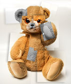
I think that the image of the teddy bear is my most successful simple collage, as the variety of scaling has resulted in a more distorted image, as different areas of the teddy are disproportionate - this is particularly evident with the larger eye, and makes the image more intriguing and slightly disturbing. Moreover, despite the distorted layers, the image of the subject is still evident, and not lost in the layers. If I were to create this image again, I would distort the limbs of the bear more, to emphasise this effect.
Of my collages with the shadow-drop effect enabled, I would say that the one of the ties is most successful. This is because of the combination of the shadows, and angled images, which make the image really appear like a pile of photos, an effect demonstrated in the work of David Hockeny. However, I think this image requires smaller layers of image, with more overlap and fragmentation.
Finally, I think that my most successful coloured background development is that of the jewelry. I find this image successful, as I believe it comments well on the subject of stereotypes, as the pale pink background colour links to the subject items of jewelry and make-up. Therefore, the image has a clear meaning, and has achieved the desired effect. However, I think that the layered images are too large, not distorted enough, and therefore the collage is a little bland.
From my reflection on the successes of my developments I have been able to summarise the key note for my next developments into the following points
- Distort layers using disproportionate scales for a more disturbing and intriguing effect
- Tilt my images to make the collage look like a pile of photos, strewn across the surface
- Use smaller more fragmented layers, and a relevant background colour to emphasise the meaning of the image.
Further developments
This layering of different images reminded me of patchwork, particularly with my edit of the teddy bear, a concept I decided to explore further. Thus, I experimented with adding layers to my image, that were different in some way to the original base image; for example, I experimented with varying levels of saturation. For my experimentation process, I decided to focus on only one image, and thus explore concepts relating to just one theme.
The process of my experimention and development of my image was as follows:
1. Black and white layers with shadow drop
I began by lowering the saturation of some image layers, and applying a shadow drop to these layers.
3. Black and white + saturated layers with shadow drop
I then combined my previous ideas, using layers with a very low and very high saturation, as well as unchanged layers with shadow drop
5. Black and white + saturated layers with shadow drop improved
Finally, I switched the adjustments style of some layers, so that there would be a more equal distribution of layer styles.

1. Saturated layers with shadow drop
I also increased the saturation of some of the image layers, and applied the shadow drop effect.

2. Black and white + original layers with shadow drop
I then added the same shadow drop effect to unchanged image layers, and rotated the images more, for a more 3D collage effect.
2. Saturated layers with shadow drop - improved
To improve my image, I angled the photos more, and varied the levels of saturation more.
4. Black and white + saturated layers with shadow drop improved
Next, I angled my layers more, and varied the levels of saturation, to prevent having only 3 different types of layers
Next : This process inspired me to create a physical version of my images. To do this I will print different versions of same image - different levels of saturation, hue and size - and physically layer them. Moreover, I will experiment with different methods of layering my photos. For example, I like the concept of a 'patchwork' collage, so will stitch some photos.
As I was pleased with the outcome of my experimentation of adjusting the layers of the teddy bear image, I tried applying this same effect to my other images. However, I did not find this successful, so will develop these images differently, in ways that work better with these particular photos.


1. I do not think that the collage of the ties is particularly successful or intriguing, though it is more successful than the other images here. I like the colour variation.
2. I think that the plane collage is unsuccessful, as the colour variation is not evident because the image is mainly white, which does not show any difference.
3. I also do not find the book collage particularly successful, as the saturation layers are not well distributed enough, and there is not enough variation.
4. The jewelry and make up collage is also not successful, as the layer images are too large, and the overall image is not visually pleasing
Having learnt that my 'patchwork' style development was not successful for all my images, I decided to look at another image, and see how I could develop this in a way that worked well with this image in particular. I decided to focus on my books collage, and experimented using double exposure techniques.


First I tried making all layers of my book collage layers have a blending option of 'darker colour', and then selected the layers I wanted more visible to not have this effect. This resulted in a more fragmented looking image. I then decided to decrease the saturation of my image, but not make it black and white, just have a lower saturation. I liked this look, as the image was now more unique and intriguing, while still showing the varying hues of paper of the books. Next, I experimented with making some layers more or less saturated than others. This process was inspired by my work with the teddy bear collage, from which I learnt to vary the saturation more. Therefore, in this collage, Most layers have a very low saturation, and some layers have a slightly higher saturation, and these levels vary.
Overall, I think that this experimentation process was successful, as the resulting images were intriguing, and this style works better with this object collage than the previous one.
Next : I would like to develop this work physically. To do this, I will - similarly to my teddy bear work - print different versions of my image with different levels of saturation, and cut out areas to layer. To achieve the double-exposure effect, I will print my image on tracing paper, as this will make the layers visible through each other.
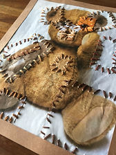
Physical developments
The next stage in my development process was to physically manipulate and layer my images. For this experimentation, I again decided to focus on one particular image, specifically that of the teddy bear, as this is one I had already developed ideas for.
First, I created several versions of the same image, each with different levels of saturation, and adjusted hue. Then, I printed these images, some larger than others, on both standard paper, and on tracing paper.
In order to create a physical version of my previously digital collages, I then used a scalpel and cutting mat to cut out different areas of my image. I decided to use a scalpel and not scissors, as this allowed me to avoid cutting through areas I might need later.
To decide which areas to cut out, I used my digital work for inspiration, making sure to have an equal distribution of saturation levels. I left one photo uncut, to use as my base image.


Then, I took the images I had cut out, and layered them over the base image. I spent some time experimenting with a variety of compositions. Throughout this process, I realised that one image I had printed was too saturated, and contrasted too strongly with my other images, so I decided to minimise having this as layers in my collage. So that I could still change how I layer my images later, I did not stick the layers down.
Once I had found a composition that I found successful, I took an image of it, so that I could return to it.
This work is very similar to my digital collages, due to the solid paper layers, and patchwork inspired style.
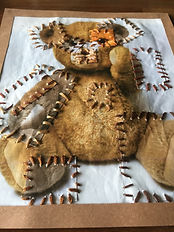
Then I decided to focus on the use of the tracing paper images as layers for my collage.
First, I cut out areas of the tracing paper image using a scalpel and cutting mat, similar to how I did with my standard paper images.
Then, I layered the tracing paper images over the solid base image I had used previously. The compositions I created expanded on the idea of creating abstract collages. I think that the tracing paper creates an almost ghostly effect, and thus I


I then decided to switch the standard paper base image for a tracing paper background, as this was more faint and fragile, which I think reflects the notion of imagination well, which is relevant to my work.
Next, I experimented with more variations of compositions,
until I achieved my final composition. I was not sure whether
or not to keep the third foot, as this would result in a better
distribution of layers, but did not work as well with the image

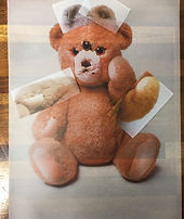
decided to add features to the bear, to create a more abstract alien figure.
as the other layered features. Once I had this final composition, I used scissors and a guillotine to refine and trim the edges of my images, so that they were neat, and layered them over the base image. I then decided to take photographs of my tracing paper collages over a light box, so that the light would shine through the layers.
Light box images


Once I had placed my collage on the light box, I perfected the placement of the layers, and photographed the light shining through the layers.
once I had taken some images of my chosen composition, I also took some photos in which I added a layer, and ones where I flipped some, though I would say these were less succesful.
Overall, I think this process was successful, as the lightbox worked well with the tracing paper layers. The thinness of the layers makes the collage almost ghostly, and thus reflects the imagination of youth. I also like how each layer is visible.
The first image is that of the composition I had chosen originally. Out of these compositions, I think that this is most successful, as it has created an abstract alien figure of the bear, yet simultaneously, the original true version of the bear is visible beneath. However, the edges of the layers are a little too visible. I think this collage could be improved if each layer had the same adjustments, and not that some are more or less saturated.
In the second image, I added a layer (a third foot), as I have previously contemplated doing. This achieved the effect of a more equal distribution of layers over the original base. However, I not think this layer works as well with the image, so this collage composition is not as successful.
In the third image, I switched the two arm layers, and flipped one. I had hoped that this would make it less obvious that the arm layers are repeated, but this was unsuccessful. The layers do not work well with the base image in this way, and it is not clear t=what the right arm is at this angle. Therefore, this was unsuccessful.
From this process, I have successfully expanded on my ideas and experimented with the use of tracing paper when printing my images. I also gained a better understanding for successful compositions.
Next: I would like to circle back to my use of standard paper, and experiment with this. Specifically, I would like to develop creating physical drop shadows, by raising some image for a more 3D collage, and experimenting with different methods of layering and joining my images (e.g. stitching my images).
Further composition experimentation
Highlighting success
1. This digital development is successful due to the variety of saturation levels working well together and the disproportionate areas creating a more unique and disturbing effect.
To improve this, I could have tilted more layers.
2. I find this digital development successful as the levels of saturation work well with the double exposing. The images have been layered well as they show the effect without making the image too messy. Having a more equal distribution of saturation would have improved this image.
2. I find this physical development successful as the light shines nicely trough the tracing paper. The added layers appear to part of the base image initially, but the overlapping edges show that they are not.
I think I could have taken a better image of this work, and added more layers

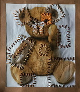
3. This physical development is successful due to the use of mixed medium and materials. The thick thread and rough sewing pattern work well with this style and image, and the colour scheme is also successful. This could be made better by not having the border frame overlapping some of the stitching, and having the paper less crinkled.
New photoshoot
Next, in order to expand my ideas more, and be able to develop my images more significantly, I decided to do another photoshoot.
To plan this, I reflected on the successes and failures of my images so far. For example, I knew I wanted to be able to create more abstract images from the photos of this shoot, and that I wanted the results to comment more dramatically on the notions of stereotypes, a concept I want to explore in my work.


initial edits
further edits


Highlighting success