Taryn Simon
.jpg)
Artist Analysis
Taryn Simon was born in 1975 and is a multidisciplinary artist who works in photography, text, sculpture, and performance, best known for her conceptual art. Simon was born in New York City and initially studied Environmental Studies at Brown University, before graduating with a degree in Art Semiotics. While attending Brown University, Simon enrolled in photography classes at the nearby Rhode Island School of Design, receiving her Bachelor of Arts (BA) in 1997. Over many years, the artist travelled to several places and undertook several projects, creating a plethora of works, including The Innocents (2002), An American Index of the Hidden and Unfamiliar (2007), A Living Man Declared Dead and Other Chapters (2008-2011), and Contraband (2010). Simon has received The Alfred Eisenstaedt Award in Photography, and the International Center of Photography Infinity Award for publication, and was selected as a Guggenheim Fellowship in 2001. Now, Taryn Simon resides and maintains a studio practice in New York City.
Taryn Simon’s work is part of the contemporary art movement; this is the art of today, produced in the second half of the 20th century or in the 21st century. Contemporary artists work in a globally influenced, culturally diverse, and technologically advancing world, thus giving them access to advanced methods and tools, to create unique, never-seen-before work. Art from this period is often a dynamic combination of materials, methods, concepts, and subjects, as evidenced in Simon’s work - the 3D element of many of this artist’s works, as well as diverse locations and variety in cultures featured in Simon’s images, clearly reflects this notion and movement.


Artist Analysis
Over a span of five days and nights in November 2009, Taryn Simon created the well-known series of work ‘Contraband’, at the U.S Customs and Border Protection Federal Inspection Site and the U.S Postal Service International Mail Facility at the John F. Kennedy International Airport in New York City. Simon photographed all objects confiscated by the TSA and Airport security, items ranging from narcotics to fruit, to animal skeletons. According to the artist, these images provided, among other notions, “a look at an attempt to control what is considered threatening to economies, to personal safety, and to a nation."
This piece is named “Handbags, Louis Vuitton”, a very descriptive, label-like name that clearly demonstrates what items have been gathered to create this work. The frame shows 16 images, collected together, all of handbags, likely from the luxury designer brand Louis Vuitton.
My immediate response to this artwork is a sense of curiosity - viewers inspect every single photograph, and cannot help but search for a connection and meaning. When contemplating this piece, my reaction is to wonder why these items, in particular, were confiscated by airport security - what makes them suspicious or dangerous? What were the owners’ reactions to having these luxury bags taken? Moreover, I imagine the identity of the owners of these objects, (what they look like, what they are like etc.), influenced by the items themselves; one can assume the identity of the people as reflected by their bags.
Visually, the composition of the work is aesthetically pleasing, due to the unity and similarness of the individual images. The perspective and structure of each photo, with a central focus, is uniform for each bag, and the colour palette, a combination of browns, blacks and whites (neutral, natural hues), make the artwork pleasing to the eye, and elucidate how, although initially appearing almost identical and alike, each item is unique and individual, and by extent, as are the owners of the bags.
Due to this sense of uniformity among the composition of each photo, one can assume that Simon utilised the same camera settings when taking these images, and commensurated visual elements to achieve this notion of similarness.
In terms of camera settings, it is probable that did not use a very small aperture, as the depth of field is quite shallow, however, the entire image is in focus, so Simon likely used a medium aperture of around f/5.6. As there is no motion blur evident, the artist would have used a fast shutter speed - however, Simon may have used a tripod, and the objects are inanimate, so this is not necessary. The images also demonstrate no grain, so the ISO setting will have been low - this will also have helped prevent overexposure. Additionally, the white balance of this series of images is considerably warm (not a cold, almost blue hue of white in the background), though not very strongly; the background is still considered a clear white.
Within the photos, there are no pronounced shadows, only very little near the bags, which suggests that more than one light source was used to prevent directional shadows. The fact that the shadows that there are, are not stark, insinuates the use of softboxes over these lights.
The structure of these images, however, also creates this sense of unity, as each image presents similar visual elements. For one, the focus of each image is clear - centred and contrasted against the plain white background, the well-lit bags immediately draw the viewers eyes, and attract attention as they are clearly presented. There are no evident lines within the photos, though the central location of the subjects, and the square crop of the images, direct viewers to these items. The lack of pronounced shadows, not only suggest the use of multiple sources of artificial lights with softboxes, but also an indoor location, and draw more attention to the subject items, as they are detailed, focused, and well-lit, helping viewers to imagine their texture, of which a variety is evident in the various bags.
The sense of unity among these photos is created by the repetition between the images, not only of lighting techniques and camera settings, but also of shape, focus, idea, and general structure. The photos, apart from the actual item photographed, seem almost identical, with the perspective and composition only varying slightly.
The lack of a crease in the background (by letting the background curve at the floor), highlights the shape and form of the handbags, as the background appears almost 2D, whereas the items are 3D, so their features are more pronounced. This background also creates a sense of space - it is difficult to tell how much distance there is between the subject and the background, and the depth of field is regarded as shallow, as the background is so plain. This also creates negative space at the borders of the photos, though not a very large amount due to the placement of the subjects centrally.
Within the series of images, the tones vary. In some images with darker, black or dark brown handbags, the subject contrasts well with the background, with a balance of light areas (highlights) and dark areas (shadows). In other images, however, there is a higher proportion of mid-tones, or light tones, dependent on the subject, though the light tone of the background prevails in each image. The colours of the images, a palette of browns, greys, blacks, and whites, are neutral, natural and complimentary. This makes the piece in general aesthetically pleasing, as the photos work well together, creating a sense of harmony, as well as reflecting the motion of unity, while the photos are still unique simultaneously.
Having analysed Taryn Simon’s work, I reflected on the notion of ‘similar but different’, and how this relates to the idea of each person’s unique identity, as well as the representation of this idea, via the photography of items belonging to different people. This is a concept I wish to incorporate in my own developments, creating images inspired by the works of Taryn Simon while simultaneously exploring key themes of identity, by representing people using their possessions in uniform images or similar.

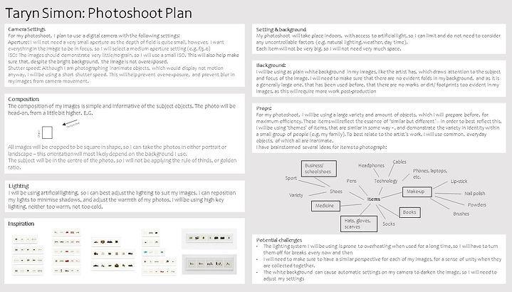
Photoshoot plan
The first step in developing my own work inspired by Taryn Simon, was to create a photoshoot plan. The purpose of this plan was to help me formulate and organise my ideas, and prepare for when I am taking my images. In this photoshoot, for which I have thus planned, I am going to take several images of a variety of objects on a plain white background, with minimal shadows; this will take place indoors, with artificial lighting -
my images will thus relate to the artist, due to the style and composition of the photos. Due to the large quantity of images I will take, this photoshoot plan is critical in ensuring efficiency and organisation. The plan will help me know what to do when, whcih items to photograph, how to prepare in advance, and what to look out for, such as well as camera settings, and potential challenges or issues, which I can better mitigate and prepare for now, due to the plan.
Contact Sheets
Wrong perspective
Geometric, regular arrangement
Multiple objects
Random arrangement
Too shadowed
Wrong perspective
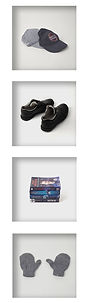
Scarves, Hats, Gloves
Combining different items
Regular arrangement
Multiple objects
Too cluttered
Single objects
Medicine
Similar compositions
Single objects
In my photoshoot, I took 194 photos of items, in various compositions; overall, I would say that my photoshoot was a success, as I took a large variety of images which I can work on, and most of my photos were in focus, an improvement from previous photoshoots. I found that my photoshoot was more helpful in this photoshoot, than in previous ones, due to several factors. Firstly, I could refer to the photoshoot in preparation for the photoshoot, so I could collect my objects before hand, and I already knew which ones I wanted to photograph. Secondly, I was aware of potential challenges, and could mitigate these better - for example, I changed the camera settings before my photoshoot, so that my images were not automatically darkened. Finally, I could also use my plan during the photoshoot, when determining perspective and composition, referring to the inspiration, and adjusting my lighting
Single objects
Make up, cosmetics
Too shadowed
Regular arrangement
Messy arrangement
Single objects
Lights turned off
Regular arrangement
Messy arrangement
From my photoshoot, I developed a better understanding of lighting techniques, due to my use of multiple light sources with soft boxes. I also learnt how to best mimic the artist's images, utilising similar compositions and perspectives.
To improve my photoshoot, I would have taken more images with a larger variety of object placements, and used different settings on my camera when photographing the dark shoes, as little detail is evident.
Experimenting with perspective
Books
Single objects
Similar coloured books grouped together
Open books
Multiple objects
Wrong perspective
Shoes
Note: In post production, I selected image 0246 for editing, rather than image 0276 (Swapped 0276 for 0246).


During my photoshoot, I changed the camera settings I was using, as my images were darker than expected, and the lighting was a bit too warm, so I adjusted my ISO and aperture to compensate for this, in order to achieve images most related to the artist.
Following my photoshoot, I created several contact sheets using photoshop - I did this so that I could have an easy overview of all my images, and annotate them before I begin developing my photos, so that I can best select which images to edit.
Once I had created my contact sheets, I annotated them, using a variety of markings. Firstly, I circled each image I thought had potential for further developments; then, I crossed out images which I thought were not successful. Next, I changed the colour of some of my circles to blue (by adjusting hue, merging layers), in order to select my most successful photos, which I will edit in my initial developments. Some images are more successful than others, generally because of a good composition and lighting. Images that were not successful had poor composition and positioning of subjects, and too pronounced/ many shadows.
Now that I have created my photoshoot, I will use my annotations to decide which images I will develop further. I will edit these images in photoshop; I will crop and rotate the photos, make the background whiter, and adjust the hue and saturation of the items, as well as using the burn and dodge tools to draw attention to certain aspects of each image.
Overall, I would say that the style of images - specifically the high key lighting, white background and general composition - make my images relate well to the artist.
For my initial edits, I grouped my images based on their category, and selected items from each person for this category, such as the scarves, hats and gloves, the shoes, and the books. This allowed me to explore how the subjects were all similar yet different, similar to the identity of their owner's, a concept drawn from Simon's work.


Winter miscellaneous
For these images, I needed to mute some bold colours, to achieve softer colours. I think that the variation in object placement of these photos is successful, however, the camera angle varies too much.
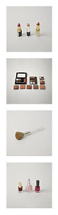
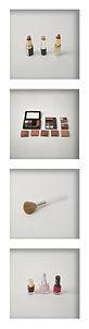
Makeup
For these edits, I experimented with adjusting the hue of some areas. I think that the colours of these images work well together, despite the bolder shades, which is successful. Moreover, the composition and camera angle are similar across the photos, so these edits would work well in a grid. However, the background is not light enough.


Books
I find these edits less successful, perhaps due to the harsher colours, which make these images less aesthetically pleasing and find these photos less intriguing than others.. However, the camera perspective and white background were successful.


Formal Shoes
I think that these images convey the notion of 'similar but different' well, and have a successfully light background. However, it was a challenge to bring out detail and texture on the dark material of the shoes, and I need to edit out the remaining shadows for more successful images.
Initial edits
After I had created my contact sheets, I was able to edit my images for my first developments, which consisted of 15 edits.
To create these images, I used Photoshop to adjust the levels and curves of the images to achieve the lightest colour background, without over-exposing the subject. I then used layer masks to lighten the background only, and not the subjects. Once the optimal background had been achieved, I edited the subjects; to do this, I first adjusted the hue and saturation of the objects, and then used the burn and dodge tool to draw attention to the subjects, and remove blemishes. This was particularly useful with the images of the shoes, where I could add more detail to the dark surfaces. In some images (specifically of the makeup), I also used the patch and spot heal tool to remove marks and other blemishes.
Thus, the subjects stood out more against the background, as it was lightened, and bright distracting colours were muted and softened, while unwanted marks were removed.
This resulted in the images becoming more visually appealing, due to the softer colour palette, and lighter backdrop.
This colour palette is one success of my initial developments, as similar to the works of Taryn Simon, relating subjects are of a similar colour scheme, with only a few bold colours. This allows the images to work well together when put together in a grid.
Another success of my images is the composition and perspective. I think that my photos mimic the artist's well in the style, as the subject is centred in a square crop, and the camera angle is from slightly up, yet very front-on. This angle is very informative of the objects, enabling viewers to clearly see the items and understand them. Moreover, my images display few shadows, which is successful as Simon's work does not show many shadows. To achieve this effect, I used a variety of lights with softboxes to limit shadows when taking my images during the photo shoot, and edited out remaining shadows in post-production, using curves adjustment and the dodge tool.
However, I think my images could still be improved greatly and were only successful to an extent. The background within my images still varies in colour - I only achieved a white background in some of my edits, so the background is not light enough on most of my images. Additionally,m I think my camera angle, though relatively successful, should be slightly lower to best mimic the artist. I would also need more images to create 'grids' like Taryn Simon. These are all factors that I will remember when creating a second photo shoot, which I will do for my third development (from which I will create said grids), as I think these images are not successful enough.
In general, however, the style of my images does reflect that of the artist, Taryn Simon. This has been achieved by the light white background, camera perspective and only mildly varying compositions of the objects. Moreover, the concept of the mages is similar to Simon's, as the photos can be collected to great one large piece, emphasising the theme of identity.
I definitely think that the artist has created much more successful photos, as they are more intriguing and the colour palette is more coordinated, resulting in more aesthetic images on the whole. I will use different coloured items in my next shoot to develop this notion.
From this process, I have developed a better understanding of lighting techniques and the use of camera angles and perspectives. I have also learnt how to extend the background of my images in photoshop, where my images are missing areas for the correct square proportions. I also developed more attention to detail in my editing process and used highlights and shadows to manipulate the objects' appearance.
Moving forward, I wish to experiment with these images to create my own developments, not particularly similar to the artist. This will help me experiment with my ideas and create unique creative edits, though I will not develop these further.
Moreover, I wish to do a second photoshoot to develop my work in relation to the artist. For my grid compositions, I want to take more successful images, as I do not think these are good enough. In this photoshoot, I will learn from my previous mistakes, such as having a lighter background, shooting from a lower angle, and working with a more similar colour palette. Additionally, in my next developments, I want to explore concepts of identity in more depth, focusing on the ubiquitous issue of modern stereotypes. I will select different items for this, and group my images per person, rather than per object.


In my process, the next step was selecting my most successful edits and reflecting on why these might be considered more successful than others. This allows me to consider how I can develop my work onwards, and understand what I can do better with my next edits.
Generally, I find the compositions of these images successful. I think that the scarf has been laid down and positioned in a way that reflects its delicacy well, which is critical in my reflection of stereotypes, as this links to the idea of feminine fragility. Moreover, I think that the muted colours of the hats in the second edit are successful, as well as the slightly imperfect placement of the hats. I think the colours contrast well too, making the image more intriguing. Next, I also think that the camera angle and composition of the lipstick is successful, as it is different to my other images, and clearly elucidates the notion of 'similar but different', which was my intention with these images. Finally, I think that I have brought out the detail of the black material of the shoe successfully, and this image has a satisfactory white background, unlike my other edits.
From this process, I have learnt that to make my next edits and images more successful, I need to:
- Create more complex, intriguing compositions when positioning my items
- Have a lighter, white background
- Use complimenting/ contrasting colours, with muted tones


Highlighting success
DEvelopments:
Multiple exposures
In my experimentation with my edits, I tried creating multiple exposures of my edits. This allowed me to collect the images from a particular theme into one edit each. To do this, I added multiple layers on photoshop, and adjusted blending options. I also used the eraser and dodge tool to prevent shadows and ensure a white background. One challenge of this process, was that the images quickly became too grey and dark, as most of the image backgrounds were not white enough. Therefore, I had to use a series of layer masks and adjust curves and levels to lighten the images without overexposing the subjects.
I think these images still link to the artist, Taryn Simon, as I have used similar base edits, but have collected them differently, and into one image rather than into a large frame with a grid of edits.
I do not think I will develop this idea further however, as I wish to explore the artist in a different direction, creating larger, pieces and collecting my edits in a way more similar to the artist.


In general, I think that this process and development of my edits has helped me gain a better understanding of a variety of compositions. For example, I created two multiple-exposure images with the shoe edits - this allowed me to experiment with different perspectives and compositions, and, while I find neither edit particularly aesthetically pleasing, I think that this process has helped me understand how I can manipulate similar edits to create very different images. I also tried to create an interpretation of reality with my books, as at first glance, they seem simply piled up, but are actually overlayed and skewed, , which relates to the concept of identity as 'there is more than it seems', encouraging viewers to look closer, similar to the artist's images. Moreover, in some of these images, I have taken Simon's idea of collecting the objects in an easily understandable, regular, simple pattern, and reversed it; instead, I collected my items in a seemingly random pattern, as though they are piled up. I think this makes for a more intriguing and complex composition.


Out of my multiple-exposure developments/ experimentations, I think that these three images are the most successful, as they are more complex. In general, I am pleased with the white background, as it is light enough to contrast the items, without creating an overexposed or too bright image, as well as the way my items overlap - at a first glance, they do not appear to overlap but clearly do upon closer inspection. The developments with the medicine and makeup are similar, as the objects have been arranged in a more random 'pile'. This process of collecting my initial edits was interesting and resulted in a more curious development. I think that these images are emphatic of the notions linked to the items, and highlight these notions in a similar way to the work of Taryn Simon. Moreover, my edit of the books is very different from my other developments, as I overlayed my edits to look as though the books were stacked, in a tower leaning over. The books look as though they should fall, due to the 3D effect of this angle. I think that this makes my image more interesting, although, I do not think this edit relates as much to the concepts I am exploring with my work.
Highlighting success: 2
Grid developments


Next, I took all my edits of my images of hats, gloves and scarves and placed each image with an equal border, and a white background.
Only once I was happy with the composition did I experiment with also applying a shadow effect, trying different opacities distances, spreads, and angles until I achieved the desired effect. However, I think I did this better in the following images, as this shadow is more of a border for the image, and has a too large spread - it does not create a 3-dimensional effect.

Then, I repeated this process with my next set of edits - featuring make-up. First, I created a grid without a shadow drop effect, and then one with. This time, I used a more defined edge for the shadow, and chose a different angle. This created a more 3D effect, making the images look framed.
After, I created a similar grid featuring the items associated with young boys, all with a similar colour scheme (blue). Once I had the shadowed grid edit, I decided to change the colour of the border to a blue that worked well with the blue hues in the images. I think this reflects the idea of identity and stereotypes well.


I repeated this process on another set of images, this time featuring items associated stereotypically with teenage girls. Here, I decided to use a different composition from a standard strip, so created this 2x3 grid. Then I selected a colour from one edit, decreased its brightness, and used this for the border, also to comment on stereotypes.


For the next set of images, I recorded the process in more detail. First I collected images some might associated with a woman, all with shades of orange or yellow. Once I created my original grid (1), I rearranged the edits to better emphasise the colour scheme (2). Then, I selected the colour I wanted for the border from within the edits. The colour was first too dark (3), then too bright (4), and then successful (5).

My final grid combined two of my previous ones. This was the vertical grid of the makeup items, and the young boy items. I combined the two vertical strips into a 2x4 grid. I then made sure that the shadows did not clash as much.
I find that this was successful, as the two sides clearly juxtapose, and so highlight the notion of stereotypes. This use of contrasting motifs is something I would like to develop further in my work, as I think it was successful and effective.


The next step in my image development was to create grids of my work, as the artist does. To do this, I first selected one set of edits, and experimented with these to achieve my desired effect. First, I began with a dark background, so I could see the borders of my images easier, as I moved my photos for the correct proportions and distances. Then, I darkened the background of these images, and made the border of the grid white. Finally, I added a shadow effect, to make the grid seem more like a frame.
Different grid format of same images.
I think that this shadow style fits this 2x2 grid better than the horizontal strip.


Highlighting success: 2
Annotation
Chessboard composition