Acerca de
Tatiana Parcero
Tatiana Parcero
Tatian Parcero is a photo and video-based artist, who focuses on Mexican Postwar and Contemporary Art, born in1967. Since 1992, she has lived in New York and Miami. She now currently lives and works in Buenos Aires, Argentina. Her work has featured in several key exhibitions and at famous galleries and museums, including the museum of Contemporary Art, Tokyo, and the Jdc Fine Art. The haunting images found in her photographs are autobiographical histories. She maps her own body with ancient Aztec codices. By layering images laden with biographical and mythical content, she re-invents her own personal experiences whilst also allowing the juxtapositions to reflect the experiences of others. In her work, she aims to educate viewers and relates corporeal as a map to relate concepts such as nature, migrations, identity, territory, and time. She blends various techniques and visual media, including monochrome and colour photography, digital images, and video. At the present time she explores the impact of climate change and the preservation of the natural environment through her work.
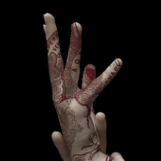
Parcero produces a range of pictures all edited with overlays of designs layering on top. I chose this specific image to analyse due to the unique diagrams layered on the original composition. The first thing that is striking about this photo is the central position of the composition. Whilst some may argue that this makes the image plainer, in this scenario it means that the audience is presented with a strong bold pattern and not distracted by the potential other positioning of the hands. Furthermore, the image was taken using low key lighting and high contrast. Low key lighting increases the lighting ratio in the scene, creating more contrast between the darker tones and the brighter areas. This usually means the image is predominantly in shadow or dark, which is the case here. On the other hand, high contrast, means he image has a wide range of tones, highlights and shadows. It is clear to us that Tatian Parcero used natural lighting or a soft box as the image is not overly exposed; the shadows aren’t incredibly dark, however where they are cats, they are soft. She most likely photographed with daylight or sing a soft box. Either only one soft box was used, front facing, or she used two, one on either side, which we can infer from the way the image is illuminated. Regarding the layered image, it is obvious that the colours have been slightly desaturated as to not overwhelm the overall photos. The layered image illustrates veins and arteries, and the audience re left feeling captivated but also fascinated by the diagram. Furthermore, this makes us feel as though Parcero’s work holds a profound meaning behind it, as we long to uncover the true story behind her image.
Parcero’s work is inspirational in my opinion because it feels as though it has no boundaries. It is clear to me that her work does not possess any beginnings or ends. Jdc Fine Art, a gallery showcasing her work described her work as “just connections and inclusions. Rather than being redundant, Parcero’s work becomes meditative, reflexive, spiritual, even station-like”. Her work resonates with me and leaves me contemplating the significance of the composition and the overlay projected over. Is it personal to her? Does it have a particular meaning? Where does it originate from? Tatiana Parcero’s’ photoshoots regularly present and feature the human body, pregnant stomachs, feet, faces and hands. For me this is interesting and her decision to contrast the human form and found imagery, looks beyond the visible exterior exposing layers that are both literal and symbolic. This is something I hope to incorporate in my work.

Artist Gallery:


Photoshoot Plan:

This is my photoshoot plan for Tatiana Parcero. This includes and describes how I plan to recreate Tatiana Parcero and what elements I am going to consider when photographing. The formal elements that were key and that stood out to me in Parcero's work was her lighting. I plan to like her to use a soft box on the centre of the images to take the composition as this mean there aren't substantial amounts of shadow to interfere with the overlay. Furthermore, I am also going to be conscious of the camera angle, using a range of angles including an aerial angle. This will be achieved by positioning the camera directly above my composition. Other angels I will also utilise are close-up, to capture fine details, and medium angle, which will incorporate the whole composition. I have drawn two drawings to show what parts of the face and body I would like to photograph. The eye drawing has a pattern drawn over it in order to represent how I hopefully will make my edits.
Contact Sheet:


Contact Sheets are useful in this case to identify, which images have the most clarity and therefore will be best for the editing process. I took 54 photographs and have created a contact sheet to initialise the editing process. Some aspects I looked for when choosing, which pictures to use was how central the composition was and how well they incorporated camera techniques such as lighting and exposure. I used a mixture of natural lighting and soft box lighting when photographing and unfortunately, some of the daylight photos were over exposed on parts of the composition and underexposed on other parts. This meant it would be difficult to edit and layer the images. These images were therefore discarded and I showed this process through using crosses to highlight the bad photos and circles to show which images I am going to use. In terms of aperture, these images were taken with an f-stop of 1.8, which helps to blur the background and allow the image to focus on specific parts of the photo rather than the whole composition. This is achieved through the wider lens which then can let more light in the lens and allow better focus. To heighten this affect I use an ISO of 32.
Initial Edits:
Editing Process:

A lot, of Tatiana parker's work is highly desaturated, giving a washed out effect, so to begin with I lowered the saturation and brightness of this image, using photoshop. I also cropped the image using the rule of thirds, which helps to ensure the centre of the composition is the centre or the image.
Next, I added this marine life drawing pattern as another layer. I had to arrange it so that the centre octopus would be aligned with the vortex of the hand when blended.
Finally I blended the added layer, after rasterising it. For this image I chose the lighten option which dissolved the white background.
Initial Edits:

These are my initial Tatiana Parcero edits. I took 54 photographs and after eliminating some and selecting the others I have created, 20 edits inspired by the artist's work. To create these images, I first used photoshop to change the exposure and highlights to make the shadows balanced and not overly obvious. Then I decreased the saturation, however I made sure the images were not monochromatic as the images I wanted to recreate of Parcero's work were mostly just desaturated and not black and white. Then I used the burn tool to make sure the background was completely dark, as this would help my composition to stand out more in the edits. After that, I created a layer mask and then layered on my overlays on top of the selected layer mask, allowing me to then dissolve the pattern to make the edit look more natural. For the overlay, I alternated between maps, botanical prints, anatomical illustrations, trees and marine illustrations. A lot of Tatiana Parcero's work conveys a message and meaning and that is most commonly to reveal to people what is below the skin and the cultural identity of indigenous groups and different races of the world. This is achieved by her through highlighting certain maps, patterns and designs created and treasured by these groups.
Highlighting Success:

This gallery highlights my most successful edits, which I have chosen to be these four. The reason why I chose these four is due to the effect of the overlay. In some together of my images, the overlay does not fit as well, or does not appear as natural and effortless as these images do. Something I admired about Tatiana Parcero's work and an aspect I wanted to make sure that I recreated was how flawlessly the overlaid pattern blended with the composition. The effect of this is that it allows the meaning behind the pattern to be conveyed properly.
Editing Process:
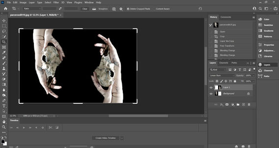
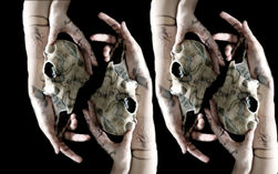
To start with, I took an edit from my first developments and cropped the background, so the image was doubled in length.
Next, I duplicated the background layer and used ctrl T to rotate it so that it mirrored the original image. The photo on the left shows the process of enlarging the additional layer so they can be identical.
After I was satisfied with the placement, I pressed enter on the keyboard and then went on to change the blending of the image to linear burn. This made the composition of the first image visible above the duplicated layer.
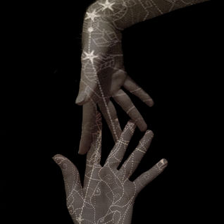
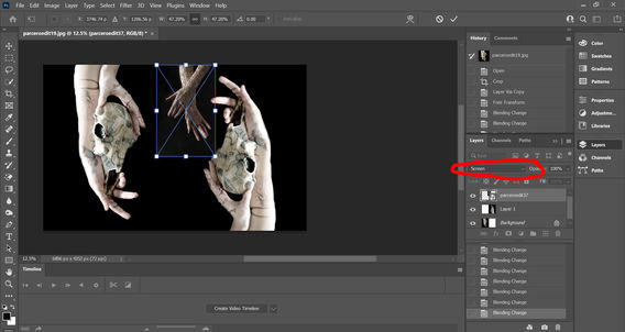
To make this image a multiple exposure edit as well as a mirrored edit, I incorporated another of my first developments, these set of hands with maps on them, because I liked the way the blue and red hues complimented each other.
Next, I changed the sizing of the new image so that it did not consume the skeleton and then used the screen blending change to better blend the background of the image.
Finally I duplicated this image and rotated it 180 degrees clockwise placing it opposite the originals current position. I then used the magic eraser tool to create a layer mask, which dissolved the background of the image.

Multiple Exposure Edits:
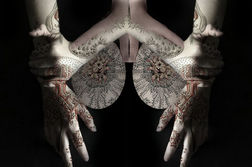

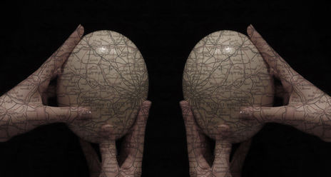
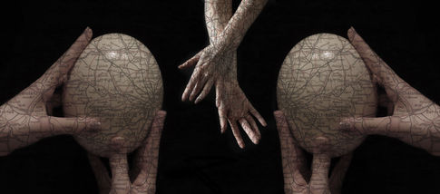
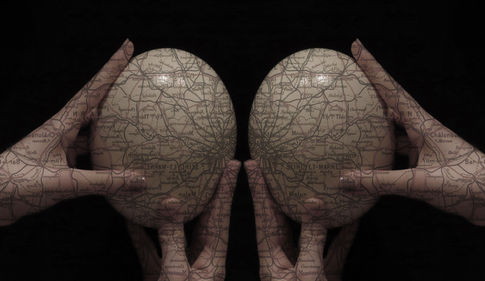
These are my double exposure edits that explore a different way of editing and go above and beyond Tatiana Parcero's edits. For these, I used my Tatiana Parcero inspired edits and used photoshop to crop them and then duplicate the layer. After duplicating the layer I was careful to ensure that the two images were identical, in length, height and width. I then flipped them or layered them, so that they mirrored each other. This creates a surreal effect and further heightens the dramatics of the edits. I made 7 of these edits and some are included in my final Tatiana Parcero edits.

Highlighting Success:

For these multiple exposure edits, I decided to make a Highlighting Success section because it firstly was easier for me to separate my more successful edits from the less successful edits and secondly to properly present the best of my double or triple exposure edits. I liked these edits the most because the layering looks natural and it blends well with the composition, whereas some of my other edits were less successful as some of the ways in which I organised the additional layers, was not as well executed in my opinion as these. Due to all this, I chose my favourite four edits to present here.
Bordered Edits:

In regards to AO4, I decided to create bordered edits, I chose to do this because I believe it allowed me to show more about my understanding of editing and using photoshop in a way to enhance Tatian Parcero's work. The use of borders her is important because it further emphasises the composition and the message behind the layered image. For example, to the left of this, is a cluster of three of my initial edits, which I edited onto a template. I was then able to blend them after confirming the arrangement. I then changed the border, by using a plant overlay. I manipulated the saturation to add a green tint to the images. The use of a forest Green here makes the red stand out and therefore, enhances the effect of the edit on the viewer.
Highlighting Success:

To create a showcase of my favourite bordered edits, I selected the three most successful images. I chose these edits based on the originality of them and the ability to best reinforce what I had learned about Tatiana Parcero. I thought it was important to show that I could use my initial edits that had been an imitation of Parcero's work and then enhance them to make them unique to me. The borders change the audiences view of the patterns layered on top of the edits. I made sure to match or oppose borders with the overlays so that they related and made them look more fluid. These were more successful as they make the edit look bold and stand out. This was what I was keen to achieve.
Editing Process:
I've created this section to visually depict how I edited my Tatiana Parcero inspired photographs. I used adobe photoshop for the whole for this process.

To begin with, I selected one of the images I had taken. I chose this specific one because I liked the way that the egg was the centre of the composition, yet the hands were still at a different angle. I felt as if this made the image more bold. Firstly, I made sure the background is completely dark by either using the paint tool, burn tool, or by decreasing the exposure of the images. For this specific one burn tool was used, I then desaturated the photo to imitate Parcero's edits.
Whilst deciding on an overlay, I made sure to consider the object I would be layering the pattern on. In this case it was a round ostrich egg and hands and I wanted something that would not overwhelm the composition, but also would add depth to the image. This map was ideal because the it wasn't too busy and had streaks of colour in it that would compliment my work.
Next, I had to create a layer mask, so that I could later insert my chosen map. I selected the hands and egg and then confirmed the mask. Then to add my image, I uploaded it and then cropped and adjusted the position to best fit the composition. After rasterizing the layer, the image was ready to be blended.
Because I had already created my layer mask, I had to move it onto the map and then using the dissolve tool I changed the blending option, opting for decreasing the opacity on the lightening option. After then adjusting the saturation again to best recreate Parcero's edits, another initial edit was completed and I could upload it to my website.
After creating my edit, I decided to further develop it by creating a multiple exposure version. I used photoshop to layer two of the same edits and then angle them to be opposite but also merged with one another. I then used the lighter colour option to blend anything that was irrelevant to what I wanted to achieve.
I wanted to extend on this edit by adding a border and experimenting with a different layout. I used my initial edit to create double exposure and I mirrored the two layers precisely. This added a sense of symmetry to the edit, obvious often in Tatiana Parcero's work. I then created a border by layering the map and cropping the inside to show my edit.
Reshoot:
Contact Sheet:

As a part of a reshoot, I created a contact sheet for Tatiana Parcero inspired edits. What is different about these images is that the composition is focused mainly on the body, chest, neck, face, eyes, side profile. Furthermore, these were taken on a white background rather than a black background. I used red circles and red crosses to show which photographs I am going to edit.
Edits:

I created a reshoot for Tatiana Parcero and changed the composition of these edits. I decided to create body edits for Tatiana Parcero. This was because I found that a lot of my previous edits only consisted of hands and objects. To vary, I explored the face, body and side profile. I also changed the patterns that I overlaid. In regards to the editing process, I repeated the same types of edits in order to show progress. I used layer masks, multiple exposure and border edits to show this. In terms of aperture, these images were taken with an f-stop of 1.8, which helps to blur the background and allow the image to focus on specific parts of the photo rather than the whole composition. This is achieved through the wider lens which then can let more light in the lens and allow better focus. To heighten this affect I use an ISO of 32.
Highlighting Success:


To show my success with this reshoot, I decided to present another highlighting success. The reason why these were my successful body edits was because they were unique compared to some of the other edits. I tried different techniques that I saw Tatiana Parcero had used. For example, for some edits I used a white background instead of a black background, furthermore, instead of adding the design as a layer mask, I blended it onto the whole image, which was something that I saw her do when she shot with a white background. In the future, I could improve my work by creating more edits of the face and eyes.

Projected images:
Contact Sheet:

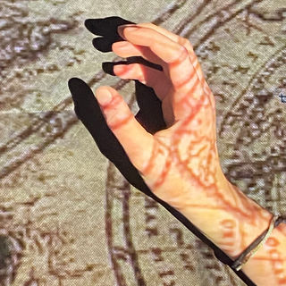
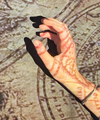
To extend on the work I have done, I projected my edits, including those from my final outcome, and some of the overlays that I had used, for example maps, floral designs. I then took photographs of hands and people underneath. This makes the edits more exciting and shows how I physically added overlays onto a person, much like in Parcero's work.
Edits:

In total, I have created 15 edits, four of which are double exposed. In regards to editing, I did not change any of the images properties except from using the cropping toll on occasion in order to make thee face pictured the cnetre of each image. I took these images using a camera with aperture of 1.8 and ISO of 132 because this makes sure that the intricate details are in focus and the background is blurred, helping draw more attention towards the projections. Furthermore, I used a lower exposure because this limits the amount of light going through the lens, making sure that the contrast between the shadows and highlights are not to harsh.
Highlighting Success:

For my highlighting success, I chose these four images because of they have the most depth. Furthermore, these projection edits build on work explored in Tatiana Parcero's art by instead of editing overlays, adding them physically before taking photos. Going forward, I would like to make a final outcome for Parcero and this page, therefore, I am going to revisit border edits, as this was my most successful work, as well as what I found most interesting.
Final Edits:

This is my final composition for my Tatiana Parcero inspired work. I decided to revist the border edits, which I created using my first developments because this was the strongest area of my work. I have presented them in a range of ways. Some having been mirrored and then presented with a border that compliments the edit. Others were first shown in my bordered edits and then selected fort his final piece.
Two of these edits are an example of double exposure with one having been bordered. The reason why I did not border the other one with the two hands facing each other is because I liked how it was not too busy and I was worried that adding a border would overwhelm the image.


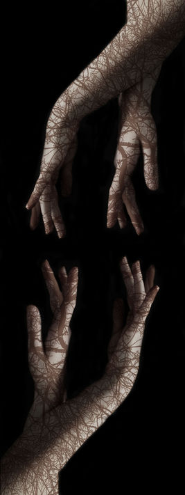

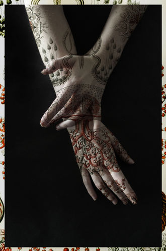
The other two final piece edits have been presented in a three division border, with an overlay having been printed onto the background. Initially my edits just recreated Tatiana Parcero's work, however through out studying this artist, I began to further develop my work to go above and further highlight my successful edits.


