Acerca de

Gjon Mili
Gjon Mili:
Gjon Mili was born on the 28th of November 1904, in Albania. In 1923, he moved to the United States to study electrical engineering at M.I.T (Massachusetts Institute of Technology) and after he graduated four years later, he began work as a Lighting Research Engineer at the Westinghouse Lighting until 1938. His passion for photography led him to create tungsten filament lamps, commonly used in colour photography. Because of this development, he was able to make a stroboscopic light. This allowed him to take photographs of moving people in a dark room with a concentrated light source, making it seem as though the subject would disappear as the lights flashed off and becoming visible again when they turned back on. His keen interest in photography led to him moving jobs and working for Life Magazine, photographing athletes, dancers, musicians, artists, and painters.
Gjon Mili famously photographed the painter Pablo Picasso for the LIFE collection with Picasso drawing with a penlight. The photographer created several films some including Picasso or Dave Brubeck. As his career and success progressed, Mili changed the type of photography he was doing as he ‘became fed up with the strobe because I had done most everything once and I did not want to repeat myself.’. He left stroboscopic effect photography and wrote ‘Photographs and Recollections’, a memoir of his career, which was published in 1980. Gjon Mili unfortunately passed away on the 14th of February 1984.

I decided to analyse this piece of Gjon Mili's work. This particular piece is part of the Phillips Collection, which showcased in 1949. Pablo Picasso drew this design for Mili and it's titled 'Light Drawing'. Technical elements that are apparent in this artists work include, exposure being increased, lack of saturation and stark contrast. In regard to saturation, Mili photographed in a time when colour photography was not common and therefore his images are mainly monochromatic. To not let this limit the image, Mili has increased the exposure to brighten the highlights. This adds a greater contrast between the black of the background and the white of the light.
Artist Gallery:


Photoshoot Plan:

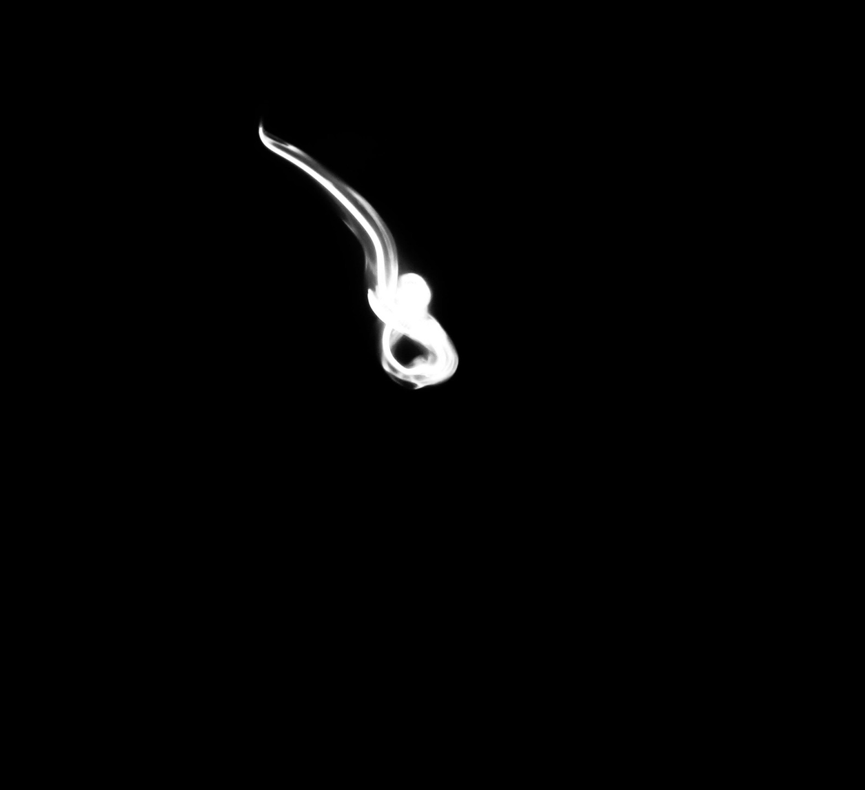
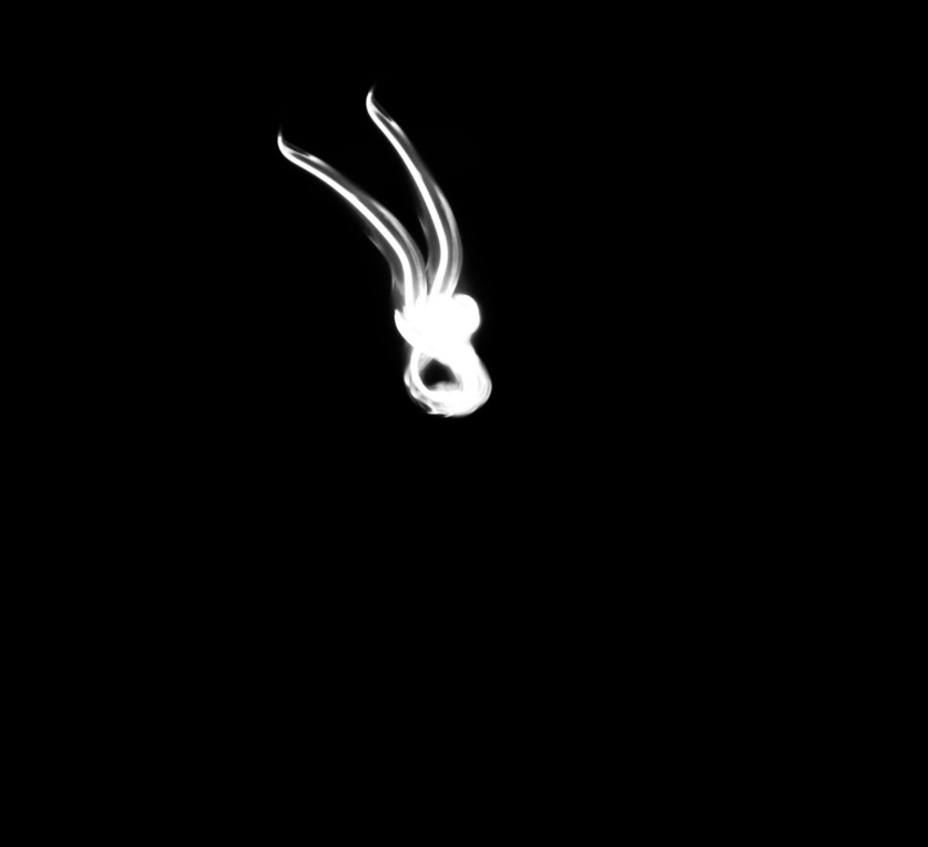
For this page of my website I created a Photoshoot plan for my Gjon Mili inspired work. It details how I plan to conduct the process of taking the images and how I will edit them as well. In the slide I have drawn three chalk diagrams of how my edits will look. I plan to create a design through the lights. The process of taking thee photos include waving a group of lights, fairy lights, LED coloured lights and a torch around frantically to create a smooth pattern. Camera settings include putting the camera on firework mode when shooting and for the lighting it is important to make sure minimal excess light is present in the room. I plan to create a number of black and white edits, coloured edits and multiple exposure edits. In terms of aperture, these images were taken with an f-stop of 1.8, which helps to blur the background and allow the image to focus on specific parts of the photo rather than the whole composition. This is achieved through the wider lens which then can let more light in the lens and allow better focus. To heighten this affect I use an ISO of 32.
Contact Sheet:

I made a contact sheet to help with the editing process. Contact sheets are useful in my opinion as they allow me to circle the photographs that I would like to go on to edit. Also, they are key for being able to compare images and identify what aspects were successful and what I should improve when shooting more compositions. For the less successful images, I used a red cross to eliminate them from the contact sheet. When choosing, which ones to edit, I assessed clarity of the photo, the composition and whether it was fully in frame.
Editing Process:
To show the steps undertaken to recreate Gjon Mili's work, I have created an editing process to show how I create some of my initial edits. These steps are repeated for my monochromatic edits but when changing the hue at the end, I make the image black and white. I have included screenshots of photoshop to highlight me editing this original image.


The first step is to use your original image and duplicate your layer. This allows you to then make the background black and get rid of excess light. I used the burn tool for this process and made sure the hardness was on zero, so that the lines were less harsh.
The next step is to change the saturation of the ight. I wanted to also change the exposure, using the levels options, I increased the exposure of the highlight, which made the blue light more visible. Next, I changed the saturation by increasing it to positive 50.
The last step is to alter the saturation under properties by changing the hue. I decided to use a warm, pink hue as this added the most depth to the image. I wanted to centralise the composition, so I cropped the image using the rule of thirds.
Black and White Edits:


The majority of Gjon Mili's work that inspired me was monochromatic and therefor I did think that it was important to create a black and white section. The lack of colour allows my edits to resemble the artists work. Some of these edits are multiple exposure because it makes them more interesting. For example the middle edit of the top row of images was created by the edit on the right of it being repeated many times to create a swirling composition. In my opinion, the monochromatic colour makes the edits less busy, which in turn may let the audience focus more on the pattern of the light. In terms of aperture, these images were taken with an f-stop of 1.8, which helps to blur the background and allow the image to focus on specific parts of the photo rather than the whole composition. This is achieved through the wider lens which then can let more light in the lens and allow better focus. To heighten this affect I use an ISO of 32.
Coloured Edits:


For this page, I wanted to show the process and progress of my Gjon Mili inspired work. Here I show my initial edits as coloured edits. I created these by taking an original photo and after editing it, then going on to change the saturation and hue based on what would best suit the composition. For some of them the original blue hue with which the photo came best suits it and for others making them slightly brighter or darker then highlights the edit and makes it stand out more. In terms of aperture, these images were taken with an f-stop of 1.8, which helps to blur the background and allow the image to focus on specific parts of the photo rather than the whole composition. This is achieved through the wider lens which then can let more light in the lens and allow better focus. To heighten this affect I use an ISO of 32.
Highlighting Success:


To present my best initial edits, I have selected my favourite four monochrome and coloured edits to format them into a section. By highlighting the most successful edits, it allows me to be able to see what I have been able to successfully accomplish in this topic and what aspects I could improve. I chose these edits because they were the most eye catching and their formal elements are the clearest. Not only do these images have the best clarity, but their composition best achieves what I highlighted in my photoshoot plan, to enhance Mili's work and to improve my editing skills.
Editing Process:
For these edits, I used images from my coloured and monochromatic edits previously shown. I have used photoshop for the editing of all of these images.
I began by duplicating the background layer and then rotated it using ctrl T. I turned it so that the image was 90 degrees clockwise.
Next, I changed the blending option to exclusion, which makes the light within the image transcend the dark background. This is what creates the multiple exposure effect. After that, I repeated the same process by duplicating the added layer twice more, each time turning it 90 degrees clockwise.
Finally, I cropped the image using the rule of thirds, which is visible here. I made sure each box had the same composition within it's opposite box, making the image symmetrical. Here I also centered the most dominant light pattern in the centre of the image.


Multiple exposure Edits:


To enhance the edits I have already created I used multiple exposure to create different edits. For some of these I layered the same image to duplicate the composition consecutively, or for others, I mirrored the edit, so that I created a symmetrical image. Another way I used double or multiple exposure was through choosing two different photos, layering and blending them to contrast and mix designs. Another thing I wanted to change was the hue of these photos. I changed the colour of the layers to vary my edits and make them more interesting.
Highlighting Success:


Similar to what I have done for my initila edits, I made a highlighting success gallery to show my best edits with multiple exposure. I chose edits with the best symmetry for this. I also liked the different colours in these edits. I felt as though these specific layered edits had the most depth and use of dimensions. The spacing of the composition was another thing that decided whether the edits were included in this section.
Advanced Edits:
Editing Process:


To advance my Gjon Mili work, I have decided to try different editing techniques such as using layer masks. For this edit, I chose one of my previous edits and opened it on photoshop. This previous edit is multiple exposure and merges four different images.
Next, I decided to add a second edit on top to fill the negative, empty space in the centre of the background photograph. The added layer is also a multiple exposure edit.
To blend these two edits, I created a layer mask. To start with, I used the quick selection tool to select the purple or light and then rasterized this layer. This then allows me to edit the layer mask, which I did by altering the blending option to screen.
To advance this edit, I duplicated the layer mask and changed the orientation, turning it 45 degrees with each copied layer. This made a more detail spiral. After adding each layer, I changed the blending option to lighten or screen depending on which fit best with my work. Overall, I made 3 copies of the original layer mask.
Finally, I was keen to add depth to the edit, which I sought to do through changing the saturation or hue for each duplicated layer. I mainly chose green and yellow hues however I left the first layer purple to help add depth and demonstrate progress within editing.
Advanced Layer Mask Edits:


To further develop my multiple exposure edits, I layered different edits using layer masks to create a kaleidoscopic effect with the images. For the edit in the bottom left corner, I repeated the same multiple exposure 5 times with the copy in the centre in a different hue (crimson). This adds depth for the image and makes the blues more deep. Other edits were a variety of my edits, some being coloured and others being monochromatic. The placement of these edits can create a symmetrical pattern and design.
Highlighting Success:


I created a highlighting success for these above edits. I decided to use these edits because they had the most depth and diversity. All of these required layer masks and layers to create them. My favourite of these edits is the first one because I think it has the most interesting composition because there are many different edits blended together.
Editing Process:
To create my Gjon Mili edits, I used photoshop to create an edit. To begin with I chose one of my original edits and changed the hue to purple rather than the initial blue light from the fairy lights I used. I also cropped the image so it was centralised. This would allow me to layer them better.
I duplicated the original edit and then rasterized the layer. Furthermore, I used the lighting option in the dissolve section to blend the layers smoothly and so they could overlap. After doing this, I was able to move the layer at a slight angle. Repeating this process multiple time the edit resembled this.
I selected all the copies of 'layer 1' (the original edit) that I had created so far and duplicated all of these. After dissolving the background through using the lighter colour option, I was able to rasterize the copied layer so that I could utilise it easily. I arranged the layer so that it was symmetrical on both sides. This resulted in this purple edit.
When I had saved the edit, I decided to create a gif out of this image. To do this I would save 36 copies of this edit, every time changing the hue of the image. I started at negative 180 and increased the hue by 10 every time until I reached positive 180. I also increased the saturation be 50 for every version of this edit. It was important to save them individually in order to make a gif.
To make a gif, I used a gif maker, which I found on a website called gifmaker.me. I uploaded each individual edit and changed the animation to speed to 50. This meant that the gif would run smoothly. I maximized the canvas size and then downloaded and saved the gif. I used this as my final edit for Gjon Mil inspired work.


Gifs / AO4 Experiments:


To finalize this page of my website that explores Gjon Mili's work, I have created a gif in order to show how the light edits I have created can come to life. It was important to me that people affiliated things with my edits, whether that's emotion or a memory or something else being portrayed to them. With this final edit, I wanted to add depth to the gif, which I achieved through making sure that the saturation of each individual version of this image was increased. The process of creating this gif is shown above in the editing process. To add variation to my final edits, I also created a black and white gif that shows movement rather than change of colours. I created this by shifting the layer slightly each time and saving individual movements separately to create a gif. My favourite part of exploring this artists work was the way that by layering different edits and using multiple exposure, there would be a kaleidoscope of colours in one edit.
Highlighting success:
This gif has been my most successful because of the way the gradual change in color is subtle and does not look fragmented. To create a gif each change in composition is one or more edits and it can be hard to ensure that these run smoothly. The gifs with movement both have moments where the images jump and the gif either restarts or carries on. This should have been more smooth, so I think in future I will look more at colour changing gifs above perhaps a gif where the composition moves.

AO4 Experiments:
Process Logs:

To extend my work on Gjon Mili and my gifs, I have decided to project them onto a black cloth and onto people's faces to show them illuminating features in a person. To do this, I used a camera to photograph the models in a dark room. The image on the left shows this process. I used the four gifs from my website and shot from different angles, some using the close-up and others using a wider angle. I also made sure the model changed expression or position to capture the light being cast on different parts of their face.
Contact Sheet:

This contact sheet includes all of the images taken in my photoshoot for my final outcome. As you can see, some images show the gif being projected onto a person's back whereas other are of hands or faces. This variety allowed me to then choose which composition worked the nicest and use those photos to edit.
Edits:


These edits have been taken using an aperture of 1.8, which helps to blur the background and allow the image to focus on specific parts of the photo rather than the whole composition. This is achieved through the wider lens which then can let more light in the lens and allow better focus. To heighten this affect I use an ISO of 32. This is a relatively high ISO and means the camera is more sensitive to light which is ideal whilst shooting in a dark room like I did. Furthermore, the edits themselves were cropped so that only parts of the gifs are focused on and the viewer can see a more zoomed version, which may focus on one eye or lips, instead of the whole face and background.
Highlighting Success:


For this highlighting success, I have featured images in which the gifs vibrant hues are enhanced by the use of facial features. The light is almost personified and made to seem more characterful through these images. I particularly like how by cropping in on a single part of the face, the more intricate lines to the light are emphasised. To develop this, I could create another gif of the light being reflected on a person's face like it is in these images
AO4 Outcome:


In order to refine my ideas to create a final outcome for this artist, I completed another photoshoot, reshooting the projections, however this time using the moving gif. For some of these images, I used card to block out parts of the projection, so that only parts of the light edit were visible on the person's face. Other images include the projected image being distorted using a glass prism. This softens the harsh light lines and creates a blend of more neutral hues. This contact sheet sows the images produced by my photoshoot. For some of these images, I have circled them as I will keep editing them on photoshop.
Editing Process:


To start with, I crop the original image using the rough rule of thirds. This means that the focus of the composition, in this case the model's eyes should be the central part of the image, in the central third.
Next, I edited the saturation of the image, to do this, I altered the properties of the image so the image was more saturated by 23 more. This makes the different hues, e.g. pinks and yellows, more bold and eye catching within the image, so that when I decrease the exposure of the image, the projection will remain visible.
Finally, I lowered the exposure of the edit to replicate how Gjon Mili's work is frequently underexposed with dark backgrounds and stark contrast between lighter or brighter shades and the dark shadows, which in this case are featured in the background of the edit.
Edits:


In total, I have 15 edits, each which feature the same projection, my moving/ rotating gif and present the light image on different elements of the model's face, whether that be her eyes, nose or forehead. Furthermore, I experimented with the angles of projections, some were vertical, others horizontal and others were slanted. To take these images I used an aperture of 1.8, which helps to blur the background and allow the image to focus on specific parts of the photo rather than the whole composition. This is achieved through the wider lens which then can let more light in the lens and allow better focus. To heighten this affect I use an ISO of 32. This is a relatively high ISO and means the camera is more sensitive to light which is ideal whilst shooting in a dark room like I did.
Highlighting Success:


I chose these images for my highlighting success because of the way the direction the model is looking in and the way the face has been titled to the side is emphasised by the slanted slit of edit exposed over the eyes, showing and creating a smooth edit with increasing depth. To expand on my work, I ma looking to create layer mask edits using these edits.
Layer mask edits:
Editing Process:


First, I duplicated the background layer. Then, I painted the bottom layer black using the brush tool. This then meant I would be able to move the layer mask onto the black background and get rid of unnecessary parts of the background, such as the plugs.
To create a layer mask, I clicked back onto the duplicated layer and used the quick selection tool to choose which parts of the image to transfer. In this case I chose the model featured in these photos. I then rasterized this layer mask and moved it onto the background layer, creating the image to the left.
To blend the two layers, I chnaged the properties of the edit in multiple ways. Firstly, I changed the saturation, increasing it, so that even when the photo is under exposed the colours remain bright and vibrant.
Finally, I lowered the exposure by decreasing the difference of the image. Then to enhance this change, I also increased the contrast so the difference between shadows and highlights are more prominent.
Edits:


I used the same images from the photoshoot previously, however I developed my exploration through using layer masks to blend backgrounds. The negative space, background, makes the edits appear more calm and means the background does not distract a viewer from the central subject, which is the model's face and the projection shown on top. A challenge of this work, was ensuring that the additional layer, when added to the background edit, blended well and a block or large contrast between the layer mask and person was not visible. To do this, I lowered the exposure of the image and increased the contrast to make the model's face darker.
Highlighting Success:


For this highlighting success, I chose these two edits because of the way my light edits have been enhanced by projecting them and how by focusing on eyes I have been able to emphasise not only the features of the model but also the stark contrast between light and dark.
Final Outcome:


Having begun looking at Gjon Mili's work by creating a set of black and white light developments, to the using layer masks, double exposure and then gifs, I wanted my final outcome to incorporate skills that I have learn through this study. The projector has allowed me to discover other methods of presenting or visualizing work. In these images I used an aperture of 1.8, which helps to blur the background and allow the image to focus on specific parts of the photo rather than the whole composition. This is achieved through the wider lens which then can let more light in the lens and allow better focus. To heighten this affect I use an ISO of 32. This is a relatively high ISO and means the camera is more sensitive to light which is ideal whilst shooting in a dark room like I did. From my experimentation, I chose two images from the first edits and then the other four were layer mask edits. Below, I have also included two gifs that I created using two videos I took during shooting. I used gif maker to convert.