Acerca de

Further Exploration:
Further Development:
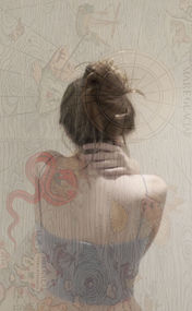
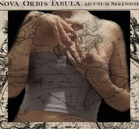
As part of my Fantastic Strange, I am going to be further developing my study on the artist Tatiana Parcero’s work. I chose this specific photographer because my photoshoot inspired by her work was the most successful. The edits I had created coordinated with each other and were successful at recreating her overlay work. I also found that a message had been conveyed, which I always thought was important to secure whilst editing my images. I also enjoyed exploring her photography style because it was unique to anything I had previously seen. My work was successful because the composition had variety and the overlays, I used also changed depending on what best fit the position of my composition.
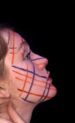
I am looking to not only develop my editing skill, but also to attempt to instead of creating a layer mask and overlaying a pattern, to place the design onto my composition during the shoot. I will either do this through placing physical objects onto my face or through using paint to create a design. In this project, I am hoping to explore the effects that the standards created in today’s world has on people. The conflict of interest that people often indulge in creates a toxic environment for humanity and this has detrimental consequences on young people. I am going to convey this message through using specific colours that represent certain emotions or flaws and contrast them against a person’s figure and facial features. For this shoot, I am going to take inspiration from Tatiana Parcero’s work and in particular the emotive way with which she conveys the meaning behind her images. As an artist, she often explores designs from indigenous groups and has been recently raising awareness towards the climate issue through photographs and edits. Like Parcero, I am going to shoot the face and in particular hands framing the face against a black background. However, to add originality to my work, I am going to be physically copying my designs onto my face instead of overlaying them on later.
Gallery of Successful Work:

Gallery of Inspiration:

Photoshoot Plan:

To show how I want to conduct this photoshoot, I have created a photoshoot plan. It highlights, the settings that I am going to photograph in, the lighting required, and the camera angle that I am going to use. In this shoot, I hope to compose several different looks and then also shoot of different parts of the body. I have drawn a figure's face with their hands and neck in the image. This represents how I am going to use my face as my canvas to convey the message behind my work. The second drawing is of a person's stomach with a design on it to reference how I am intending to paint the design onto my skin and then shoot it. In terms of timing, I will shoot for number of hours and then use photoshop to edit the images.
Contact Sheet:


I created several different looks. Some including coloured LED lights, paint and tinfoil. In regards to the composition, I used my face to model the designs at a side angle, front facing and mid view angle. To show the original photos, I edited them into a contact sheet using photoshop, which can help me visualise which images I want to go onto edit. The successful images I circled using a red circle and the photographs I wasn't going to use, I crossed out. I took over 30 images in this shoot and went on to edit the majority of them.
Initial Developments:

These images I edited on photoshop. I cropped the image and then used the burn tool to darken the background. I decided to decrease the saturation and then also increase the exposure in order to make the images have more depth and seem more realistic. For some of these I used a layer mask to change the threshold of the images, which add a paler layer to the photos. I wanted to explore the way that society attempts to merge happiness with decadence and indulgence and the fact that many people expect these two things to be harmonious. In reality, greed and material things do not result in happiness and ultimately lead to a toxic world of inequality and exploitation. I have represented this concept through the colours I have used in my composition. Orange is often associated with joy, health, enjoyment and freedom. On the other hand, purple is known as one of the most villainous colours and is associated with power, greed and indulgence. Similarly, silver represents wealth and prosperity. I specifically chose these three hues because they clash with each other despite being so often classed together. The disillusion that people have about what money and material luxury brings is as a direct result of the manipulation of the human race. Society teaches people that success and health comes from being rich, however joy is not necessarily found with money.
Highlighting Success:

I created a highlighting success to outline my progress with my independent project and to show what I had achieved. I chose these images because I liked the way that the use of hands to frame the face adds to the meaning behind the composition. It makes the actual image seem more fragile and better positioned.
Second Developments:

For my further developments, I used multiple exposure to change the appearance of my edits. Taking my original edits and duplicating the layer, I either changed the position of the second layer to mirror the first image or, I layered them to warp the impression that the work has on someone. After this, I blended the layer so that the overlay was visible and decreased the saturation where needed. The overall distortion of the human form that is displayed in my photos reflects society's manipulation of the human race. These second edits, mirror the work I did on Tatiana Parcero, as I used layer masks and multiple exposure for those edits as well.
Highlighting Success:

In this section, I chose photos, which had elements of Fantastic and Strange within them and also used what I had learned whilst studying Parcero in the most successful way. These edits were my favourite due to the way that layering through multiple exposure enhanced these edits and added to my goal.
Further Edit:

I wanted to conjoin to artists here because it further developed this edit. I used one of the multiple exposure edits I had just created and layered one of my monochromatic Gjon Mili edits into the centre. Mirroring the light edit, I wanted it to add depth to the image and attract someone viewing this edit to the centre. It creates the impression that the person's figure is reflecting off of water. This edit, used ten layers and adds variety to my independent project. I thought of using Gjon Mili because his work is bold and eye-catching.
Reshoot:
Contact Sheet:

For a reshoot, I wanted to explore a different composition and did this through the use of plasters on my face. I also photographed the body, specifically the stomach and the face so that I could overlay an image on top. I used red crosses to eliminate unsuccessful images and I circled image I wanted to edit.
Reshoot Edits:
Initial Edits:

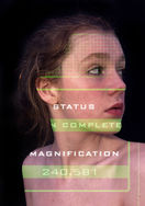
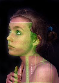
The application of plasters represented healing. I wanted to portray that the message in my first shoot causes damage. I also used this composition to further emphasise the detrimental effects that a greedy attitude has on people. Using layer masks to overlay a design I incorporated more of Tatiana Parcero's editing methods. The pattern I chose were x-ray scans and I also kept an orange tint to my edits so they would compliment my theme. Below, I also created another composition and I used green and red squiggles and multiple exposure to recreate the artists edits and to develop my independent project.

Highlighting Success:

For this highlighting success I chose images that included Fantastic and Strange properties, such as layer masks. Furthermore, multiple exposure made the figures appeared conjoined and otherwise further strange. In another shoot, I would improve this work by bordering some edits. This is something that Parcero achieved in her work.
Final Outcome:
Creative Process:

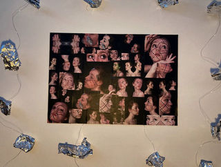
For my final outcome, I decided to print some of my edits out. These were images from my independent project. I wanted to do this because I could go onto cut around them and then potentially collage them.
For my final outcome, I decided to print some of my edits out. These were images from my independent project. I wanted to do this because I could go onto cut around them and then potentially collage them.

I decided to surround the
collage with hanging tinsel and
tinfoil. The use of silver material is significant because silver is a distinguished colour of riches and success. I want to emphasise the way in which society surrounds us with material ideas and aims and does not encourage a pursuit in one's personal happiness. This is an idea that my composition explores and promotes an answer for.
Final Outcome Experiments:
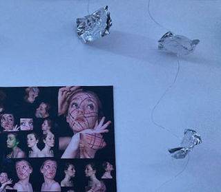
I experimented with several different possible final outcomes. This was an idea that I was keen on and thought reflected riches. I felt that the hanging silver, resembled silver descending from he sky and showering the collage. I wanted to show that society makes blankets you with money and opportunities to become rich, however they also disregard mental health and happiness, which is shown through the negative space surrounding the silver. I collaged my edits to show a chaotic calamity create by the distress of trying to achieve happiness through money. People chase success through material things and then are disappointed when it does not fulfill them.
Final Outcome:

I created my final outcome for my further exploration using collaged images which I printed from my independent project. Furthermore, I used props and objects that I believed represented wealth and money e.g. bracelets and pearls. For this final outcome, I predominantly focused on Tatiana Parcero and the topics she explored, culture and climate change. However, for my final outcome, I wanted to also have elements from Mari Mahr in my work, which I did by overlaying objects on my portraits. This was a technique I explored when studying Mahr's '13 Clues to a Fictitious Crime'. In this piece I am showing the influence of society on humanity and how the fragility of the human form is so easily corrupted by the ideas implanted in people's minds. I am exploring happiness and joy, shown through the colour orange and how these are not compatible nor do they come from money and material riches, shown through the silver objects I overlaid. I wanted to show how the only thing this leads to is indulgence and greed, which are both concepts associated with purple. Using techniques like collaging, I developed my work by adding personal elements. In the future, I could explore a different composition for my final outcome and possibly explore some of Gjon Mili's work through these images.
